Chapter 7 Applications - Graphics
7.1 Plots with base R
base-R provides already a lot of functions to create plots; we want to take a look at them in this subsection. Since we cannot go into detail concerning all parameters and arguments the functions provide, just check them out by calling the corresponding help pages (e.g. ?plot).
7.1.1 plot()
plot() allows building two-dimensional plots by simply defining two vectors x and y as follows
x <- seq(from = -8, to = 8, by = 0.1)
y <- dnorm(x = x) # density function of the normal distribution with mean = 0 and
# standard deviation = 1, by default
plot(x = x, y = y)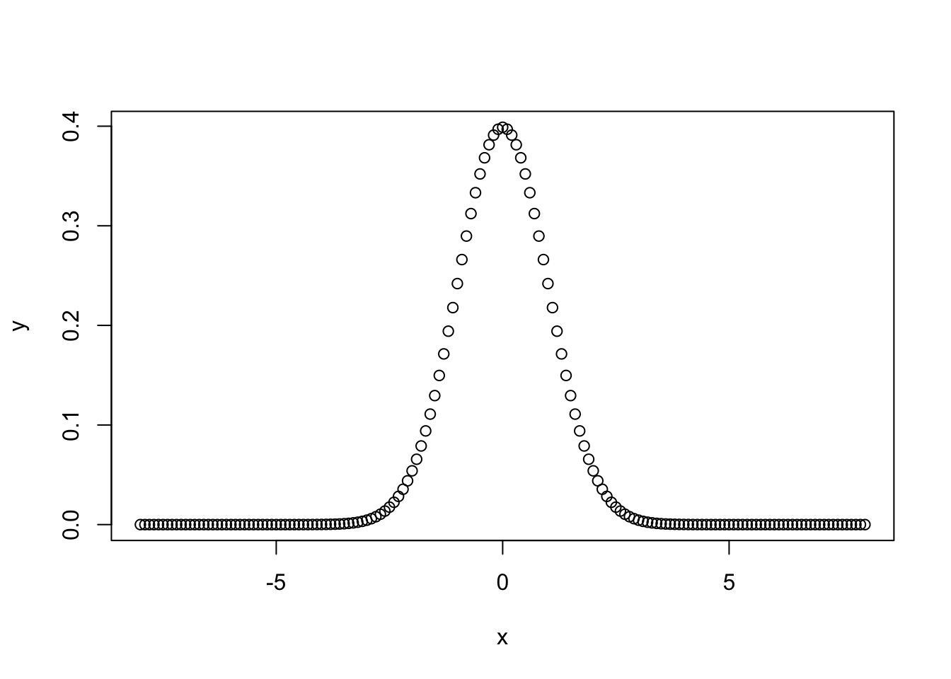
Figure 7.1: Density function of a normal distribution.
Alternatively, plot() can also handle a formula as data input like y ~ x. Consequently,
results in the same plot as in figure 7.1.
By defining the arguments main, xlab and ylab in plot(), a title for the plot, for the x and y axis can be added, respectively. Instead of plotting points, a line that goes through the points can be drawn by defining type = "l". Furthermore, both - points and a line - are visualized by calling type = "b" (b stands for both); further options are possible.
To the plot above, figure 7.1, further lines can be added by calling lines() for example:
y2 <- dnorm(x = x, mean = -1)
y3 <- dnorm(x = x, mean = 2)
plot(x, y, main = "Normal distribution - density", type = "l")
lines(x, y2, col = "cyan")
lines(x, y3, col = "blue")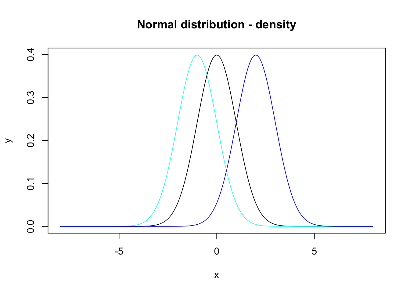
Figure 7.2: Density functions for the normal distribution with means 0, -1 and 2.
where we have also defined colors for the single lines via the argument col.
To visualize horizontal and/or vertical lines in the plot the x and y coordinates - where the lines start and end - are necessary. Adding these two lines
lines(x = c(0, 0), y = c(0, 0.4), col = "grey") # vertical line starts in (0, 0) and ends in (0, 0.4)
lines(x = c(-8, 8), y = c(0.2, 0.2), col = "darkgreen") # horizontal line starts in (-8, 0.2) and ends in (8, 0.2)
to figure 7.2 results in:
y2 <- dnorm(x = x, mean = -1)
y3 <- dnorm(x = x, mean = 2)
plot(x, y, main = "Normal distribution - density", type = "l")
lines(x, y2, col = "cyan")
lines(x, y3, col = "blue")
lines(x = c(0, 0), y = c(0, 0.4), col = "grey")
lines(x = c(-8, 8), y = c(0.2, 0.2), col = "darkgreen")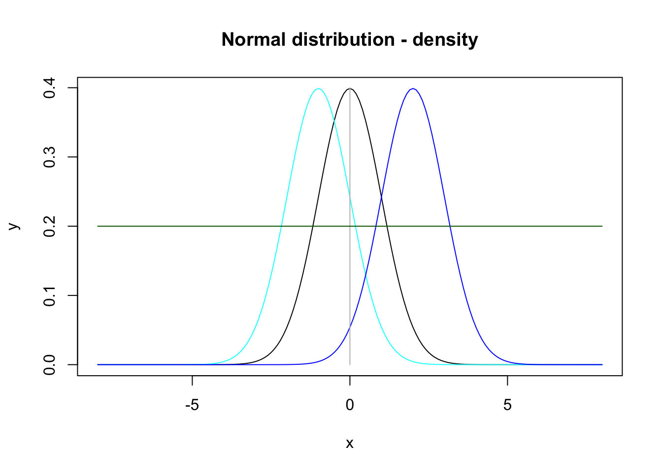
Figure 7.3: Plot of three density functions for the normal distribution with means 0, -1 and 2, respectively, and a horizontal and a vertical line.
Analogously, (further) points can be added to a plot by points() and text by text(), e.g. adding
to figure 7.3 results in figure 7.4:
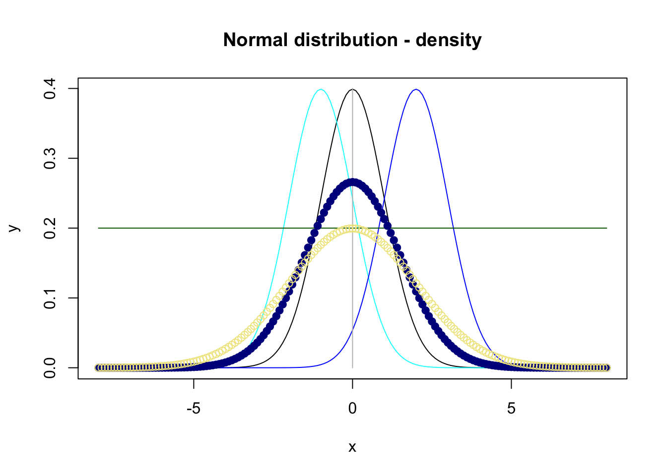
Figure 7.4: Plot of four density functions for the normal distribution.
Several arguments exist to customize points (and text); e.g. pch = 19 creates filled points. See ?points and ?text for much information.
A list of colors that can be assigned to the argument col is given by Wei (2021) (). Instead of writing the names of the colors as Wei (2021) introduces, the hexadecimal code can also be used.
After plotting the density functions in figure 7.2, it is of interest to add a legend to the plot which can be done with legend():
plot(x, y, main="Normal distribution - density", type="l")
lines(x, y2, col="cyan")
lines(x, y3, col="blue")
legend(x = "topleft", legend=c("mean = 0, sd = 1", "mean = -1, sd = 1", "mean = 2, sd = 1"),
text.col=c("black", "cyan", "blue"))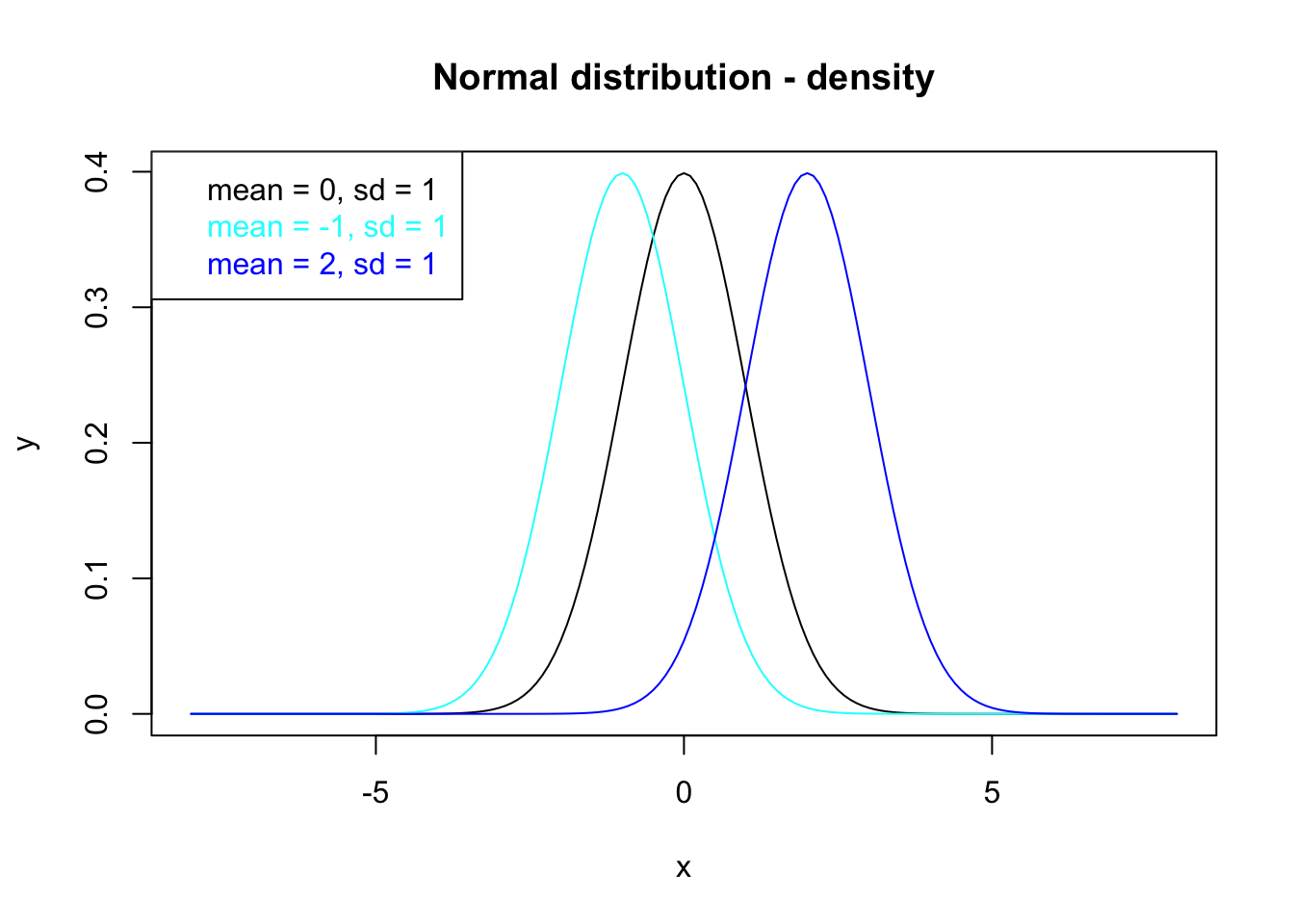
Figure 7.5: Density functions for the normal distribution whose properties are annotated by the legend.
where the first argument can be a pre-defined keyword (here: "topleft") or coordinates where to position the legend. The content of the legend, i.e. descriptions of the plotted data (here the distribution functions), is presented by the argument legend. Here, information about the mean and standard deviation of each density function is shown in the legend.
There are much more arguments of legend() to define, e.g.:
text.col: the color of the legend text,text.font: the font of the legend text,pch: plotting symbols,…
The legend in figure 7.5 is bad concerning mathematical notations. Therefore, the R package latex2exp by Meschiari (2022) allows integrating LaTeX into R by calling TeX() and using the known LaTeX-notation ($...$) like:
plot(x, y, main="Normal distribution - density", type="l")
lines(x, y2, col="cyan")
lines(x, y3, col="blue")
legend("topleft", legend=c(latex2exp::TeX("$\\mu=0, \\sigma=1$"),
latex2exp::TeX("$\\mu=-1, \\sigma=1$"), latex2exp::TeX("$\\mu=2, \\sigma=1$")),
text.col=c("black", "cyan", "blue"))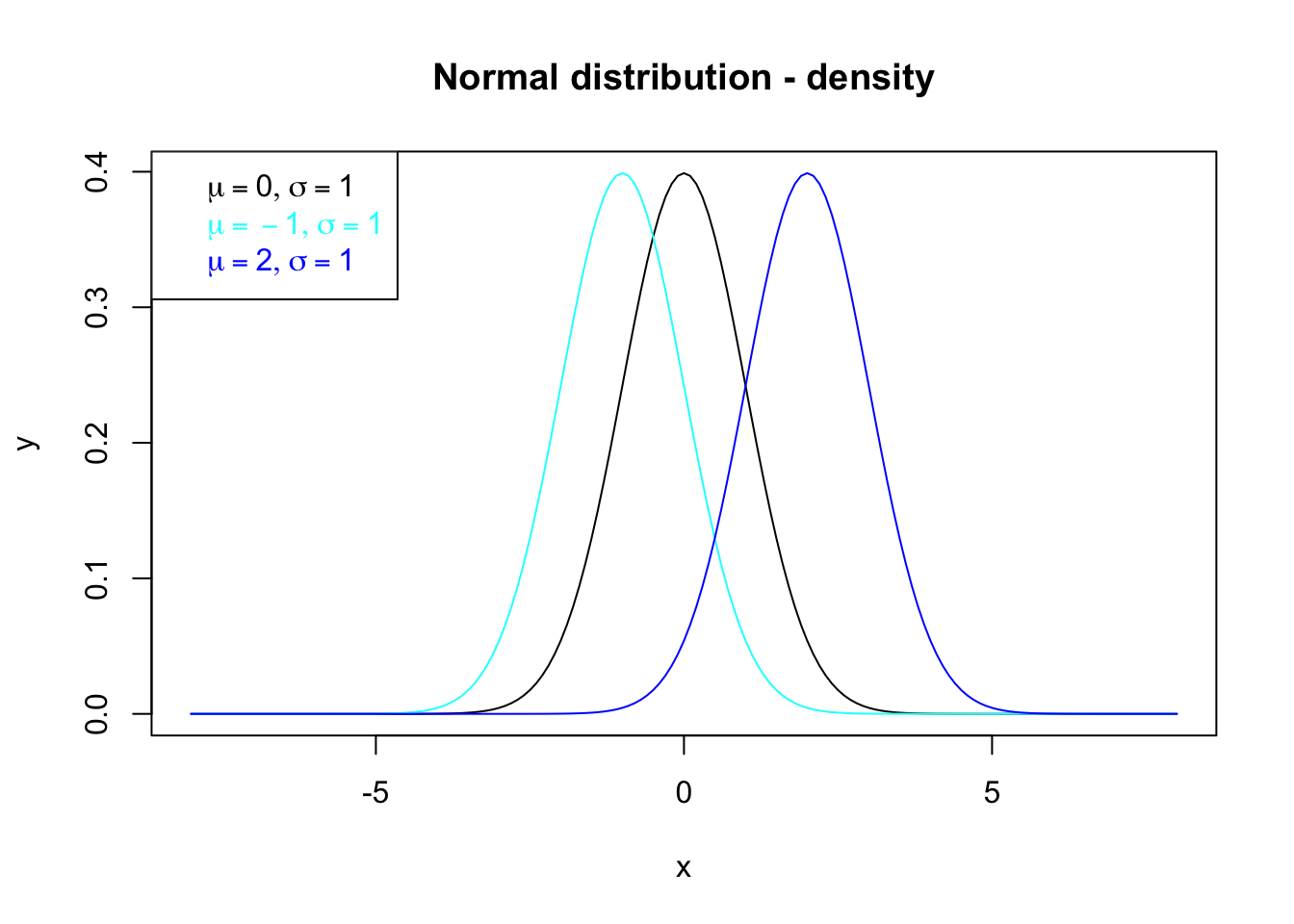
Figure 7.6: Density functions for the normal distribution whose properties are annotated by the legend based on latex2exp (Meschiari 2022).
7.1.2 Histograms and boxplots
Histograms and boxplots are helpful devices to get a closer look at the values of some variables. In the following we will focus on the airquality data set which consists of six variables in order to describe the daily air quality in New York (May to September 1973) from the R package datasets (R Core Team 2021):
#R>   Ozone Solar.R Wind Temp Month Day
#R> 1    41     190  7.4   67     5   1
#R> 2    36     118  8.0   72     5   2
#R> 3    12     149 12.6   74     5   3
#R> 4    18     313 11.5   62     5   4
#R> 5    NA      NA 14.3   56     5   5
#R> 6    28      NA 14.9   66     5   6
A Histogram for example of the variable Temp (Temperature in °F) (R Core Team 2021) can be created based on hist() like this (we already know the arguments xlab, ylab and main from plot()):
h_temp <- hist(x = airquality$Temp, xlab = "Temperature [°F]", ylab = "Count",
               main = "Histogram - Temperature")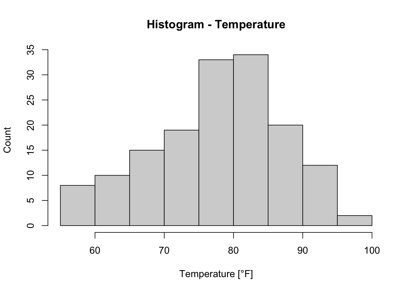
Usually, when a plot is assigned to a variable (here we assigned the histogram of Temp to h_temp), the plot will not be shown, but this is not the case here. The argument plot of hist() is set to TRUE by default (see ?hist).
The benefit of assigning the histogram to a variable (here: h_temp) is that we can access information about the plot, i.e. histogram:
#R> $breaks
#R>  [1]  55  60  65  70  75  80  85  90  95 100
#R>
#R> $counts
#R> [1]  8 10 15 19 33 34 20 12  2
#R>
#R> $density
#R> [1] 0.010457516 0.013071895 0.019607843 0.024836601 0.043137255 0.044444444
#R> [7] 0.026143791 0.015686275 0.002614379
#R>
#R> $mids
#R> [1] 57.5 62.5 67.5 72.5 77.5 82.5 87.5 92.5 97.5
#R>
#R> $xname
#R> [1] "airquality$Temp"
#R>
#R> $equidist
#R> [1] TRUE
#R>
#R> attr(,"class")
#R> [1] "histogram"
From that we see the following:
breaks: the bin boundaries,counts: the counts in (a,b],density: relative frequencies divided by binwidth, here: density =h_temp$counts / sum(h_temp$counts))/5,mids: midpoints of the bins,equidist: whether distances between breaks are the same andthe class of
h_tempwhich is a “histogram” (see also?hist).
If it is desired to compare histograms with each other, it will be helpful to plot them on top of each other or side by side. In our example, we plot the histogram of Temp and of Wind on top of each other by defining par(mfrow = c(2, 1)) (the first values indicates the number of rows (here: 2) and the second value indicates the number of columns (here: 1)):
par(mfrow = c(2, 1)) # c(r,c): c(number of rows, number of columns)
hist(x = airquality$Temp, xlab = "Temperature [°F]", ylab = "Count",
     main = "Histogram - Temp.") # main  = "" to leave out the title
hist(airquality$Wind, xlab = "Wind [mph]", ylab = "Count",
     main = "Histogram - Wind")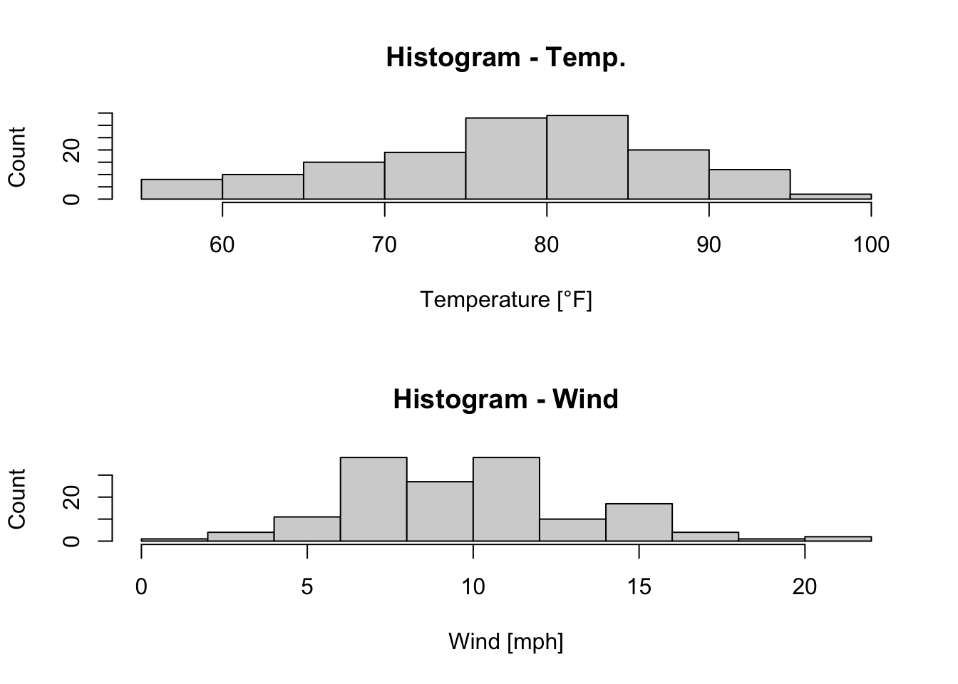
Figure 7.7: Histograms of the temperature and the wind speed of the airquality dataset (R Core Team 2021).
In order to create boxplots in base-R the function boxplot() is available which works similarily like hist() (and plot()).
par(mfrow = c(1,2)) # c(r,c): c(number of rows, number of columns)
b1 <- boxplot(x = airquality$Temp, main = "Boxplot - Temperature [°F]")
b2 <- boxplot(x = airquality$Wind, main = "Boxplot - Wind [mph]")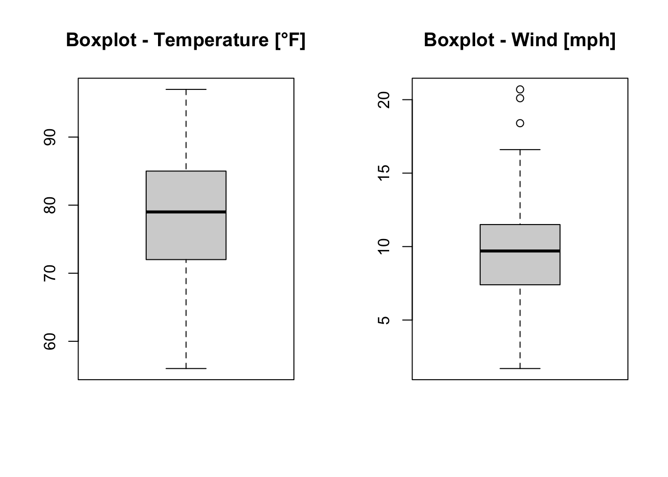
Figure 7.8: Boxplots of the temperature and the wind speed of the airquality dataset (R Core Team 2021).
When we assign the boxplots of the temperature (Temp) and the wind speed (Wind) to b1 and b2, respectively, we get information about the boxplots. Exemplarily, we look at b2:
#R> $stats
#R>      [,1]
#R> [1,]  1.7
#R> [2,]  7.4
#R> [3,]  9.7
#R> [4,] 11.5
#R> [5,] 16.6
#R>
#R> $n
#R> [1] 153
#R>
#R> $conf
#R>           [,1]
#R> [1,]  9.176285
#R> [2,] 10.223715
#R>
#R> $out
#R> [1] 20.1 18.4 20.7
#R>
#R> $group
#R> [1] 1 1 1
#R>
#R> $names
#R> [1] ""
with its return values:
stats: lower whisker, \(q_{0.25}\), \(q_{0.5}\), \(q_{0.75}\) (25 %-, 50 % (Median)- and 75 %-Quantile) and upper whisker (the whiskers extend to maximal \(1.5 \cdot \text{ interquantile range }\) by default),n: number of non NA observations,conf: lower and upper extremes of the notch,out: any data point outside the whiskers,group: indicating to which group the outliers belong andnames: naming the groups (seegroup).
Based on the information saved in b2 and the functions points() and text() important values are marked in our boxplot (figure 7.9).
boxplot(x = airquality$Wind, main = "Boxplot - Wind [mph]", medcol = "chocolate")
points(x = rep(1,length(b2$out)), y = b2$out, col = "orange", pch = 19)
points(x = 1, y = min(airquality$Wind), col = "khaki3", pch = 17)
points(x = 1, y = max(airquality$Wind), col = "darkred", pch = 17)
text(x = 0.7, y = b2$stats[3,], labels = b2$stats[3,], col = "chocolate")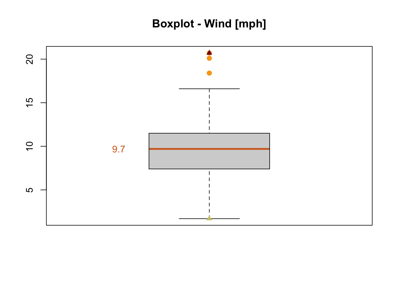
Figure 7.9: Boxplot of the wind speed of the airquality dataset (R Core Team 2021).
Question:
Which values of the boxplot are marked in which color?
7.1.3 Scatterplots and linear regression
When the variable Wind is plotted dependent on the variable Temp in figure 7.10, a negative relation is obvious: The higher the temperature, the lower the wind speed.
![Scatterplot of the wind speed dependent on the temperature [°F] of the airquality data set (R Core Team 2021).](bchwtz-cswr_files/figure-html/scatterplot-temp-wind-1.png)
Figure 7.10: Scatterplot of the wind speed dependent on the temperature [°F] of the airquality data set (R Core Team 2021).
Based on the relation between Temp and Wind, we define a linear model
whose regression line can be added to our scatterplot by calling the function abline() like this:
plot(x = airquality$Temp, y = airquality$Wind, xlab = "Temperature [°F]",
     ylab = "Wind [mph]")
abline(air_model, col = "blue")![Scatterplot of the wind speed dependent on the temperature [°F] of the airquality data set (R Core Team 2021) with a linear regression line.](bchwtz-cswr_files/figure-html/scatterplot-temp-wind-linReg-1.png)
Figure 7.11: Scatterplot of the wind speed dependent on the temperature [°F] of the airquality data set (R Core Team 2021) with a linear regression line.
Since air_model is a regression object (see argument reg of abline()), its coefficients (intercept and slope) will be extracted by calling coef() and then a corresponding line is drawn based on abline() (see figure 7.11).
The manual page of abline() (see ?abline) as well as
#R> function (a = NULL, b = NULL, h = NULL, v = NULL, reg = NULL,
#R>     coef = NULL, untf = FALSE, ...)
#R> NULL
reveal that
the intercept and slope (arguments
aandb) can be manually defined to draw a corresponding line,a horizontal line can be drawn by defining
h(the y-value(s)) anda vertical line can be drawn by defining
v(the x-value(s)).
Remember in figure 7.3 we added a horizontal and a vertical line by using lines().
Do the following:
Instead of defining the vertical and horizontal lines in figure 7.3 by
lines()useabline().
7.2 Plots with ggplot2 (Wickham 2016)
Another form of plots are ggplots which are based on the R package ggplot2 by Wickham (2016). As we will see, ggplots are especially helpful by handling multiple variables.
The name of the package indicates that the plots are based on the Grammar of Graphics. (Wickham 2016) Basically, the Grammar of Graphics is a system with strict rules that describe how statistical graphics are generated based on raw data. (Wilkinson 2010) This means, a defined syntax - which components are necessary to build a plot - and a semantic - how the components will be interpreted to create a plot on the whole - exist. (Wilkinson 2010; RStudio, PBC 2021)
We are not going into detail concerning the Grammar of Graphics; there is an own book about it, see Wilkinson (2005). We will focus on how ggplot2 realizes the Grammar of Graphics and how you can create plots with ggplot2.
As the ggplot2 Cheatsheet (RStudio, PBC 2021) introduces only a data set, a coordinate system (grid), geoms (visual points representing data points) as well as aesthetics (i.e. variables of the data set have to be mapped to properties of the geom) are necessary to create a graph as we will see. The ggplot2 Cheatsheet (RStudio, PBC 2021) as well as the manual pages of the functions of the ggplot2 package (Wickham 2016) are the basis for the creation of the following ggplots, their descriptions and further explanations.
ggplots are divided in layers which are concatenated by a “+” sign: The first layer, which cannot be leaved out, includes the data; this is realized by ggplot() (see code below). Its first argument is the data set (here: df) followed by the name of the variables that will be plotted (here: mapping = aes(x = x, y = y) . By only calling ggplot() as described, no data in form of points, lines etc. will be visible since geoms have not been defined, so far.
To overcome this, one of the geom_*() functions is called which specifies how the data will be visualized, for example by points (geom_point()), by a line (geom_line()), in form of a boxplot (geom_boxplot()), a histogram (geom_histogram()), etc.
#R>      x            y
#R> 1 -8.0 5.052271e-15
#R> 2 -7.9 1.118796e-14
#R> 3 -7.8 2.452855e-14
#R> 4 -7.7 5.324148e-14
#R> 5 -7.6 1.144156e-13
#R> 6 -7.5 2.434321e-13ggplot(data = df, mapping = aes(x = x, y = y))+ # initialize a ggplot object
geom_point()+ # visualize data points
ggtitle("Density function of normal distribution")+ # adding a title to the plot
xlab("x")+ # labeling the x axis
ylab("density") # labeling the y axis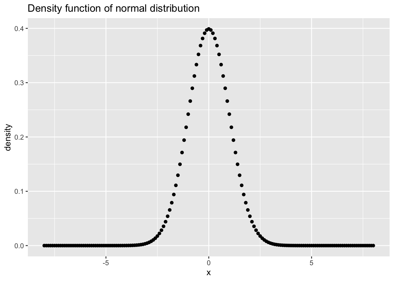
Figure 7.12: Density function for a normal distribution with \(\mu = 0\) and \(\sigma = 1\) as a simple ggplot.
Furthermore, a title for the plot as well as for the x- and y-axis have been added to the plot by the functions ggtitle(), xlab() and ylab(), respectively, and by using the “x”-sign (see also 7.13).
ggplot(data = airquality, aes(x = Temp, y = Wind))+ # initialization of a ggplot object
geom_point()+ # adding points to a plot
ggtitle("Scatterplot of temperature and wind speed")+ # adding a title to the plot
xlab("Temperature [°F]")+ # labeling the x axis
ylab("Wind [mph]") # labeling the y axis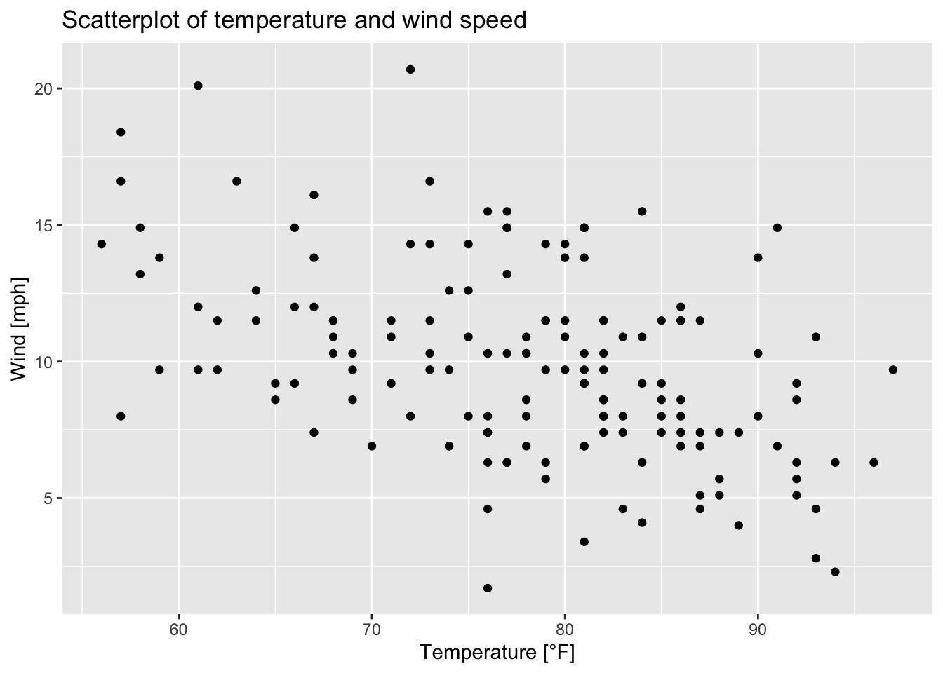
Figure 7.13: Scatterplot of wind speed vs. temperature of the airquality data set (R Core Team 2021) as a ggplot.
In the code of the plots (figures 7.12 and 7.13), the aesthetics have been defined inside ggplot(). It is also possible to define the aesthetics inside the geom_*()-function. Consequently, the following options exist:
# option 1:
ggplot(data = airquality, mapping = aes(x = Temp, y = Wind))+ # initializes a ggplot object
 geom_point()
 # option 2:
ggplot(data = airquality)+
geom_point(mapping = aes(x = Temp, y = Wind))
# option 3:
ggplot(data = airquality, mapping = aes(x = Temp))+
geom_point(mapping = aes(y = Wind))
# option 4:
ggplot(data = airquality, mapping = aes(y = Wind))+
geom_point(mapping = aes(x = Temp))
In this example, it does not matter whether the aesthetics are defined inside ggplot() and/or in geom_point() since the resulting plot does not change. In contrast to that, when we define another variable in the geom()-function (e.g. y = Solar.R) although we have already defined a y-variable in ggplot() (e.g. y = Wind), the variable Wind will be overwritten by the variable Solar.R. The y-axis is called Wind in figure 7.14, but that is not true any longer. So, we have to adjust the labeling (see figure 7.15).
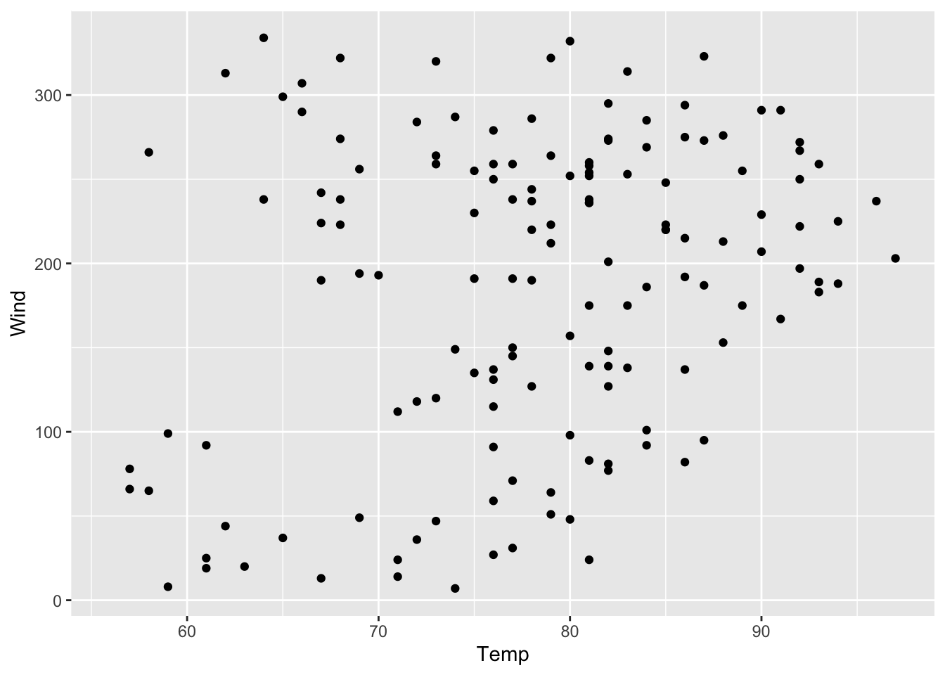
Figure 7.14: Scatterplot of solar radiation vs. temperature but with wrong y-axis-title.
ggplot(data = airquality, mapping = aes(x = Temp, y = Wind))+
geom_point(aes(y = Solar.R))+
ylab("Solar radiation [lang]")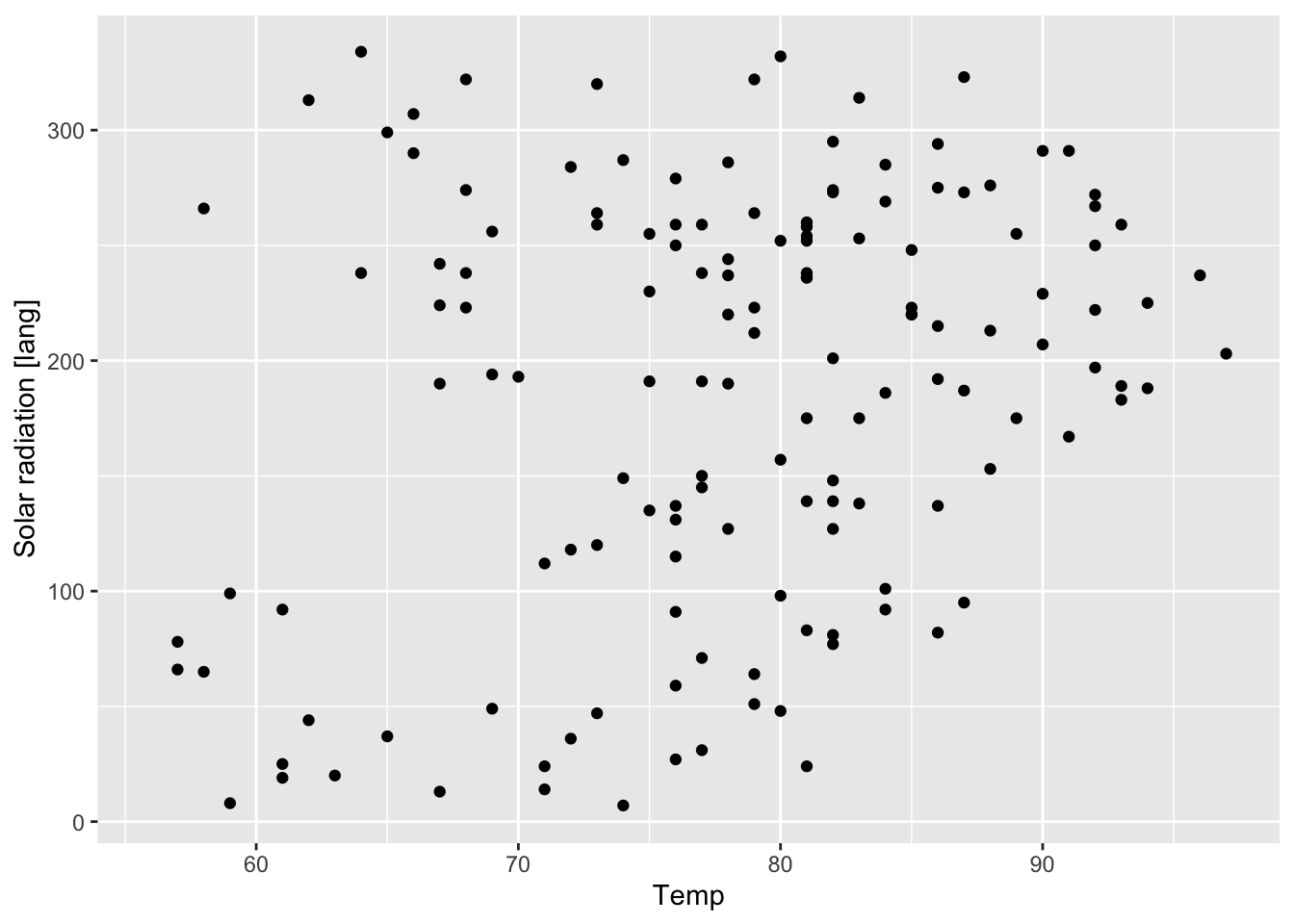
Figure 7.15: Figure 7.14 with labeling.
Dependent on the number of variables and their scale of measurement (discrete, continuous) the ggplot2 cheatsheet (RStudio, PBC 2021) shows which geom()_*-function(s) to use. The stat_*()-function(s) work similarily as the geom()_*-functions (stat_*()- and geom_*()-functions are equivalents), e.g.
ggplot(data = airquality, mapping = aes(x = Temp, y = Wind))+
  geom_point(stat = "identity") # stat = "identity" by default
# is equal to
ggplot(data = airquality, mapping = aes(x = Temp, y = Wind))+
  stat_identity(geom = "point") # geom = "point" by default
Here are some of the stat_*()- and geom_*()-function equivalents based on (Arnold 2020):
geom |
stat |
|---|---|
geom_bar() |
stat_count() |
geom_bin2d() |
stat_bin_2d() |
geom_boxplot() |
stat_boxplot() |
geom_contour() |
stat_contour() |
geom_count() |
stat_sum() |
geom_density() |
stat_density() |
geom_density_2d() |
stat_density_2d() |
geom_hex() |
stat_hex() |
geom_histogram() |
stat_bin() |
geom_qq_line() |
stat_qq_line() |
geom_qq() |
stat_qq() |
geom_quantile() |
stat_quantile() |
geom_smooth() |
stat_smooth() |
geom_violin() |
stat_violin() |
geom_sf() |
stat_sf() |
Based on this introduction of ggplots, we can easily reconstruct the plots we created in base-R (see section 7.1). Before we do that, it is recommended to save the variables in a data frame:
x <- seq(from = -8, to = 8, by = 0.1)
y <- dnorm(x = x)
y2 <- dnorm(x = x, mean = -1)
y3 <- dnorm(x = x, mean = 2)
nd <- data.frame(x, y, y2, y3)
head(nd)
#R> x y y2 y3
#R> 1 -8.0 5.052271e-15 9.134720e-12 7.694599e-23
#R> 2 -7.9 1.118796e-14 1.830332e-11 2.081177e-22
#R> 3 -7.8 2.452855e-14 3.630962e-11 5.573000e-22
#R> 4 -7.7 5.324148e-14 7.131328e-11 1.477495e-21
#R> 5 -7.6 1.144156e-13 1.386680e-10 3.878112e-21
#R> 6 -7.5 2.434321e-13 2.669557e-10 1.007794e-20Then, the single curves are added to the ggplot by adding layers (for each curve one layer) to the plot. Here, geom_line() is used to visualize the curves in form of lines. Furthermore, the following code chunk shows that the lines are colored by defining the argument color outside of aes().
ggplot(data = nd, mapping = aes(x = x))+
  geom_line(mapping = aes(y = y), color = "blue", size = 2, linetype = "dotted")+
  geom_line(mapping = aes(y = y2), color = "#7FFF00")+
  geom_line(mapping = aes(y = y3), color = "yellow")+
  ggtitle("Normal distribution - density")
#R> Warning: Using `size` aesthetic for lines was deprecated in ggplot2 3.4.0.
#R> ℹ Please use `linewidth` instead.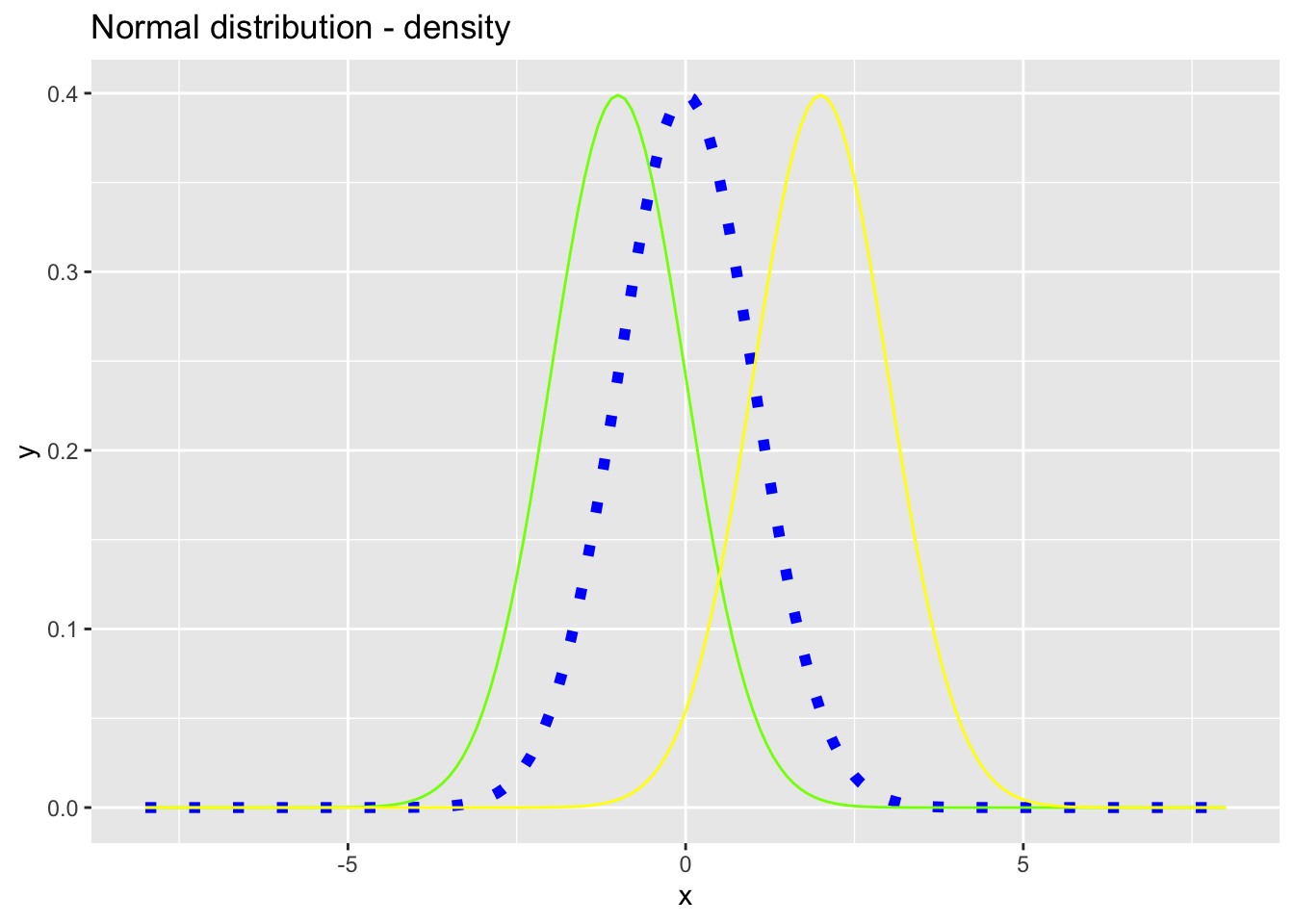
Figure 7.16: Density functions for the normal distribution with \(\mu_1 = 0\), \(\mu_2 = -1\) and \(\mu_3 = 2\) and \(\sigma_1 = \sigma_2 = \sigma_3 = 1\).
Instead of adding each density function to the plot by calling geom_line() again, it is possible to add all curves to the plot by calling geom_line() only one time.
For this, we have to modify the data set. We just want to call the x variable (x values) and the y variable (the density values of each curve) and color the values by the name of the curve (y, y2 and y3). This is achieved by lengthens the data set:
nd2 <- data.frame(x = rep(x, times = 3), density=c(y, y2, y3),
                  curve = c(rep("y", times = length(y)),
                            rep("y2", times = length(y)),
                            rep("y3", times = length(y))))
 head(nd2, n = 10)
#R> x density curve
#R> 1 -8.0 5.052271e-15 y
#R> 2 -7.9 1.118796e-14 y
#R> 3 -7.8 2.452855e-14 y
#R> 4 -7.7 5.324148e-14 y
#R> 5 -7.6 1.144156e-13 y
#R> 6 -7.5 2.434321e-13 y
#R> 7 -7.4 5.127754e-13 y
#R> 8 -7.3 1.069384e-12 y
#R> 9 -7.2 2.207990e-12 y
#R> 10 -7.1 4.513544e-12 y#R> x density curve
#R> 162 -8.0 9.134720e-12 y2
#R> 163 -7.9 1.830332e-11 y2
#R> 164 -7.8 3.630962e-11 y2
#R> 165 -7.7 7.131328e-11 y2
#R> 166 -7.6 1.386680e-10 y2
#R> 167 -7.5 2.669557e-10 y2
#R> 168 -7.4 5.088140e-10 y2
#R> 169 -7.3 9.601433e-10 y2
#R> 170 -7.2 1.793784e-09 y2
#R> 171 -7.1 3.317884e-09 y2
#R> 172 -7.0 6.075883e-09 y2#R> x density curve
#R> 323 -8.0 7.694599e-23 y3
#R> 324 -7.9 2.081177e-22 y3
#R> 325 -7.8 5.573000e-22 y3
#R> 326 -7.7 1.477495e-21 y3
#R> 327 -7.6 3.878112e-21 y3
#R> 328 -7.5 1.007794e-20 y3
#R> 329 -7.4 2.592865e-20 y3
#R> 330 -7.3 6.604580e-20 y3
#R> 331 -7.2 1.665588e-19 y3
#R> 332 -7.1 4.158599e-19 y3
#R> 333 -7.0 1.027977e-18 y3In the first column, the x values are repeated three times (for curve y, y2 and y3). The second column consists of the density values of curve y, y2 and y3 and the last columns assigns the name of the curve to each value. Consequently, the data set nd2 has three times more rows than nd:
#R> [1] 161#R> [1] 483The code to reproduce figure 7.16 is shortend:
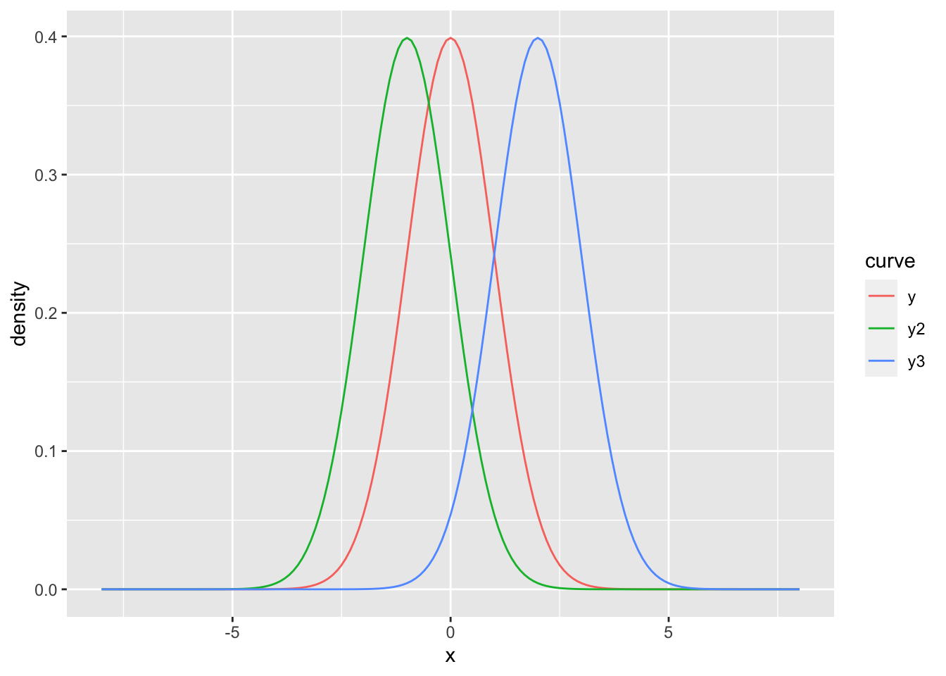
Figure 7.17: Density functions for the normal distribution with \(\mu_1 = 0\), \(\mu_2 = -1\) and \(\mu_3 = 2\) and \(\sigma_1 = \sigma_2 = \sigma_3 = 1\).
Now, the three curves are not colored by defining color outside of aes(). Instead, color is defined inside aes() since we have called a variable (named curve). So, we can conclude from that:
Single lines, points, etc. are colored by defining the aesthetics arguments outside of
aes().Coloring values of a variable by its categories (here: the curves’ names (
y,y2andy3) are forming three categories) is achieved by assigning the variable’s name to thecolorargument insideaes().
It the latter case, a legend will be automatically added (see figure 7.17).
A smart solution to lengthens the data set - instead of using rep() - is provided by pivot_longer() from tidyr-package created by Wickham and Girlich (2022):
nd2 <- nd %>% pivot_longer(cols = c(y, y2, y3)) # columns y, y2 and y3 are concatenated
# to form one column, the other columns will be adjusted automatically
head(nd2)
#R> # A tibble: 6 × 3
#R> x name value
#R> <dbl> <chr> <dbl>
#R> 1 -8 y 5.05e-15
#R> 2 -8 y2 9.13e-12
#R> 3 -8 y3 7.69e-23
#R> 4 -7.9 y 1.12e-14
#R> 5 -7.9 y2 1.83e-11
#R> 6 -7.9 y3 2.08e-22Based on the data set nd2, it is now easy to fill curves by calling fill = curve inside aes() (analogous to the argument color) and using geom_polygon() where alpha stands for the degree of opacity:
ggplot(data = nd2, mapping = aes(x = x, y = density, fill = curve))+
  geom_polygon(alpha = 0.4)+
  scale_fill_discrete(name = "Density", labels= c(latex2exp::TeX("$\\mu_1=0, \\sigma_1=1$"),
  latex2exp::TeX("$\\mu_2= -1, \\sigma_2=1$"), latex2exp::TeX("$\\mu_3=2, \\sigma_3=1$")))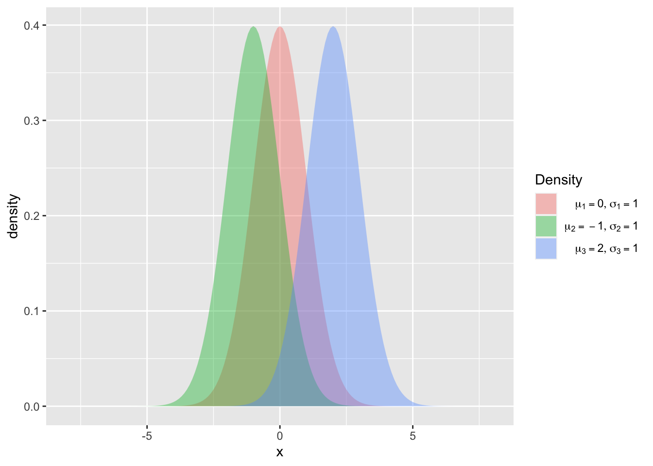
Figure 7.18: Density functions of a normal distribution with \(\mu_1 = 0\), \(\mu_2 = 1\) and \(\mu_3 = 2\) and \(\sigma_1 = \sigma_2 = \sigma_3 = 1\) with filled curves.
As we have already seen in section 7.1, the package latex2exp (Meschiari 2022) is used to customize the legend.
7.2.1 Histograms and boxplots
The creation of histograms in ggplot2 is implemented by the geom geom_histogram() which is exemplarily applied to the wind speed and temperature of the airquality data set (R Core Team 2021). The arrangement of ggplots (on top of each other, side by side, …) is achieved by using an extra R package called gridExtra (Auguie 2017):
g1 <- ggplot(data = airquality)+
  geom_histogram(mapping = aes(x = Wind))
g2 <- ggplot(data = airquality)+
  geom_histogram(mapping = aes(x = Temp), binwidth = 5)
grid.arrange(g1, g2, ncol = 2) # arrange both histograms in one row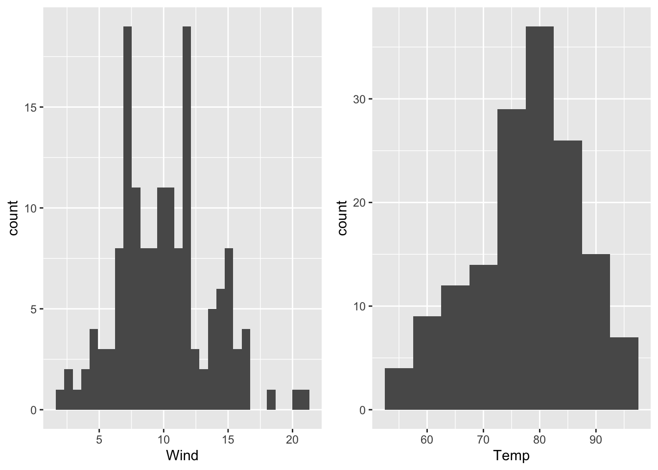
Figure 7.19: Histograms of wind speed (binwidth: default value) and temperature (binwidth = 5) of the airquality data set (R Core Team 2021).
Since the two boxplots have been assigned to g1 and g2, respectively, information can be received by applying ggplot_build():
#R> [[1]]
#R>    y count  x xmin xmax     density    ncount  ndensity flipped_aes PANEL group
#R> 1  4     4 55 52.5 57.5 0.005228758 0.1081081 0.1081081       FALSE     1    -1
#R> 2  9     9 60 57.5 62.5 0.011764706 0.2432432 0.2432432       FALSE     1    -1
#R> 3 12    12 65 62.5 67.5 0.015686275 0.3243243 0.3243243       FALSE     1    -1
#R> 4 14    14 70 67.5 72.5 0.018300654 0.3783784 0.3783784       FALSE     1    -1
#R> 5 29    29 75 72.5 77.5 0.037908497 0.7837838 0.7837838       FALSE     1    -1
#R> 6 37    37 80 77.5 82.5 0.048366013 1.0000000 1.0000000       FALSE     1    -1
#R> 7 26    26 85 82.5 87.5 0.033986928 0.7027027 0.7027027       FALSE     1    -1
#R> 8 15    15 90 87.5 92.5 0.019607843 0.4054054 0.4054054       FALSE     1    -1
#R> 9  7     7 95 92.5 97.5 0.009150327 0.1891892 0.1891892       FALSE     1    -1
#R>   ymin ymax colour   fill linewidth linetype alpha
#R> 1    0    4     NA grey35       0.5        1    NA
#R> 2    0    9     NA grey35       0.5        1    NA
#R> 3    0   12     NA grey35       0.5        1    NA
#R> 4    0   14     NA grey35       0.5        1    NA
#R> 5    0   29     NA grey35       0.5        1    NA
#R> 6    0   37     NA grey35       0.5        1    NA
#R> 7    0   26     NA grey35       0.5        1    NA
#R> 8    0   15     NA grey35       0.5        1    NA
#R> 9    0    7     NA grey35       0.5        1    NA
where
countdescribes the number of points (values) in the bin,the intervals of the single bins are defined as (
xmin,xmax] which is thebinwidth(Since we have definedbinwidth = 5, all intervals have the same size (5).),xis the center of the interval andmuch more information.
#R> [1] "list"Instead of defining the binwidth we can specify the number of bins (argument bins), e.g.:
Then, the number of rows in
#R>     y count        x     xmin     xmax     density     ncount   ndensity
#R> 1   1     1 54.66667 52.38889 56.94444 0.001434720 0.02941176 0.02941176
#R> 2  10    10 59.22222 56.94444 61.50000 0.014347202 0.29411765 0.29411765
#R> 3  10    10 63.77778 61.50000 66.05556 0.014347202 0.29411765 0.29411765
#R> 4  12    12 68.33333 66.05556 70.61111 0.017216643 0.35294118 0.35294118
#R> 5  19    19 72.88889 70.61111 75.16667 0.027259684 0.55882353 0.55882353
#R> 6  28    28 77.44444 75.16667 79.72222 0.040172166 0.82352941 0.82352941
#R> 7  34    34 82.00000 79.72222 84.27778 0.048780488 1.00000000 1.00000000
#R> 8  20    20 86.55556 84.27778 88.83333 0.028694405 0.58823529 0.58823529
#R> 9  15    15 91.11111 88.83333 93.38889 0.021520803 0.44117647 0.44117647
#R> 10  4     4 95.66667 93.38889 97.94444 0.005738881 0.11764706 0.11764706
#R>    flipped_aes PANEL group ymin ymax colour   fill linewidth linetype alpha
#R> 1        FALSE     1    -1    0    1     NA grey35       0.5        1    NA
#R> 2        FALSE     1    -1    0   10     NA grey35       0.5        1    NA
#R> 3        FALSE     1    -1    0   10     NA grey35       0.5        1    NA
#R> 4        FALSE     1    -1    0   12     NA grey35       0.5        1    NA
#R> 5        FALSE     1    -1    0   19     NA grey35       0.5        1    NA
#R> 6        FALSE     1    -1    0   28     NA grey35       0.5        1    NA
#R> 7        FALSE     1    -1    0   34     NA grey35       0.5        1    NA
#R> 8        FALSE     1    -1    0   20     NA grey35       0.5        1    NA
#R> 9        FALSE     1    -1    0   15     NA grey35       0.5        1    NA
#R> 10       FALSE     1    -1    0    4     NA grey35       0.5        1    NA
is equal to bins = 10.
The creation and examination of boxplots works similarily:
g1 <- ggplot(data = airquality)+
  geom_boxplot(mapping = aes(x = Wind)) + labs(x = "Wind [mph]")
g2 <- ggplot(data = airquality)+
  geom_boxplot(mapping = aes(x = Temp)) + labs(x = "Temperature [°F]")
grid.arrange(g1, g2, ncol = 2)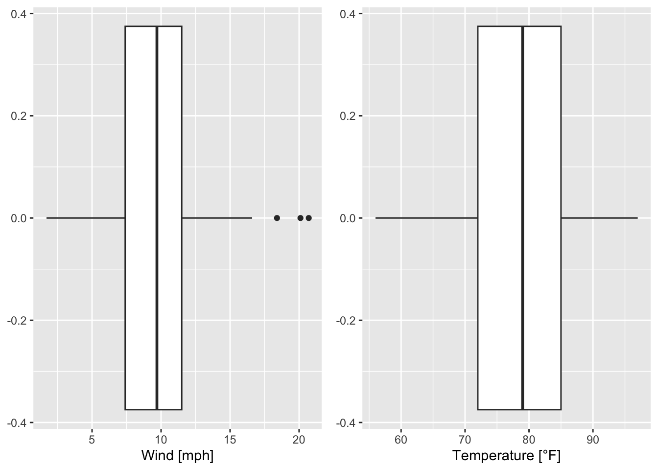
Figure 7.20: Boxplots of wind speed and temperature of the airquality data set (R Core Team 2021).
The boxplots in figure 7.20 can be flipped by using coord_flip() the following way:
g1 <- ggplot(data = airquality)+
  geom_boxplot(mapping = aes(x = Wind)) + labs(x = "Wind [mph]")+
  coord_flip() # flip coordinates
g2 <- ggplot(data = airquality)+
  geom_boxplot(mapping = aes(x = Temp)) + labs(x = "Temperature [°F]")+
  coord_flip() # flip coordinates
grid.arrange(g1, g2, ncol = 2)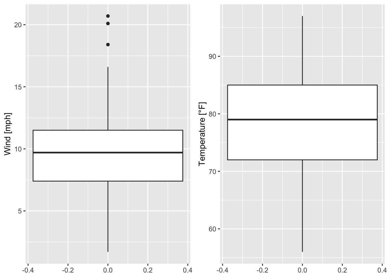
Figure 7.21: The boxplots in figure 7.20 are flipped.
Again, the data of the boxplot can be accessed via ggplot_build() as we already know:
#R> [1] "list"#R> 'data.frame': 1 obs. of 26 variables:
#R> $ xmin : num 1.7
#R> $ xlower : num 7.4
#R> $ xmiddle : num 9.7
#R> $ xupper : num 11.5
#R> $ xmax : num 16.6
#R> $ outliers :List of 1
#R> ..$ : num 20.1 18.4 20.7
#R> $ notchupper : num 10.2
#R> $ notchlower : num 9.18
#R> $ y : num 0
#R> $ flipped_aes: logi TRUE
#R> $ PANEL : Factor w/ 1 level "1": 1
#R> $ group : int -1
#R> $ xmin_final : num 1.7
#R> $ xmax_final : num 20.7
#R> $ ymin : num -0.375
#R> $ ymax : num 0.375
#R> $ xid : num 1
#R> $ newx : num 0
#R> $ new_width : num 0.75
#R> $ weight : num 1
#R> $ colour : chr "grey20"
#R> $ fill : chr "white"
#R> $ alpha : logi NA
#R> $ shape : num 19
#R> $ linetype : chr "solid"
#R> $ linewidth : num 0.5#R> xmin xlower xmiddle xupper xmax outliers notchupper notchlower y
#R> 1 1.7 7.4 9.7 11.5 16.6 20.1, 18.4, 20.7 10.22372 9.176285 0
#R> flipped_aes PANEL group xmin_final xmax_final ymin ymax xid newx new_width
#R> 1 TRUE 1 -1 1.7 20.7 -0.375 0.375 1 0 0.75
#R> weight colour fill alpha shape linetype linewidth
#R> 1 1 grey20 white NA 19 solid 0.5Consequently, the outliers are extracted by:
#R> [[1]]
#R> [1] 20.1 18.4 20.7
Based on boxplot_g1 interesting values can be marked:
wind_boxplot <- ggplot(data = airquality)+
  geom_boxplot(mapping = aes(x = Wind), outlier.colour = "orange")+ # coloring outliers
  geom_segment(data = boxplot_g1, mapping = aes(x = xmiddle, xend = xmiddle,
                                                y = ymin, yend = ymax), colour = "chocolate")+
geom_text(x = 9.2, y = -0.35, label = paste(boxplot_g1$xmiddle), color = "chocolate")+
  theme(axis.title.y = element_blank())+ # remove title of y-axis
  xlab("Wind speed [mph]")
wind_boxplot # call the defined boxplot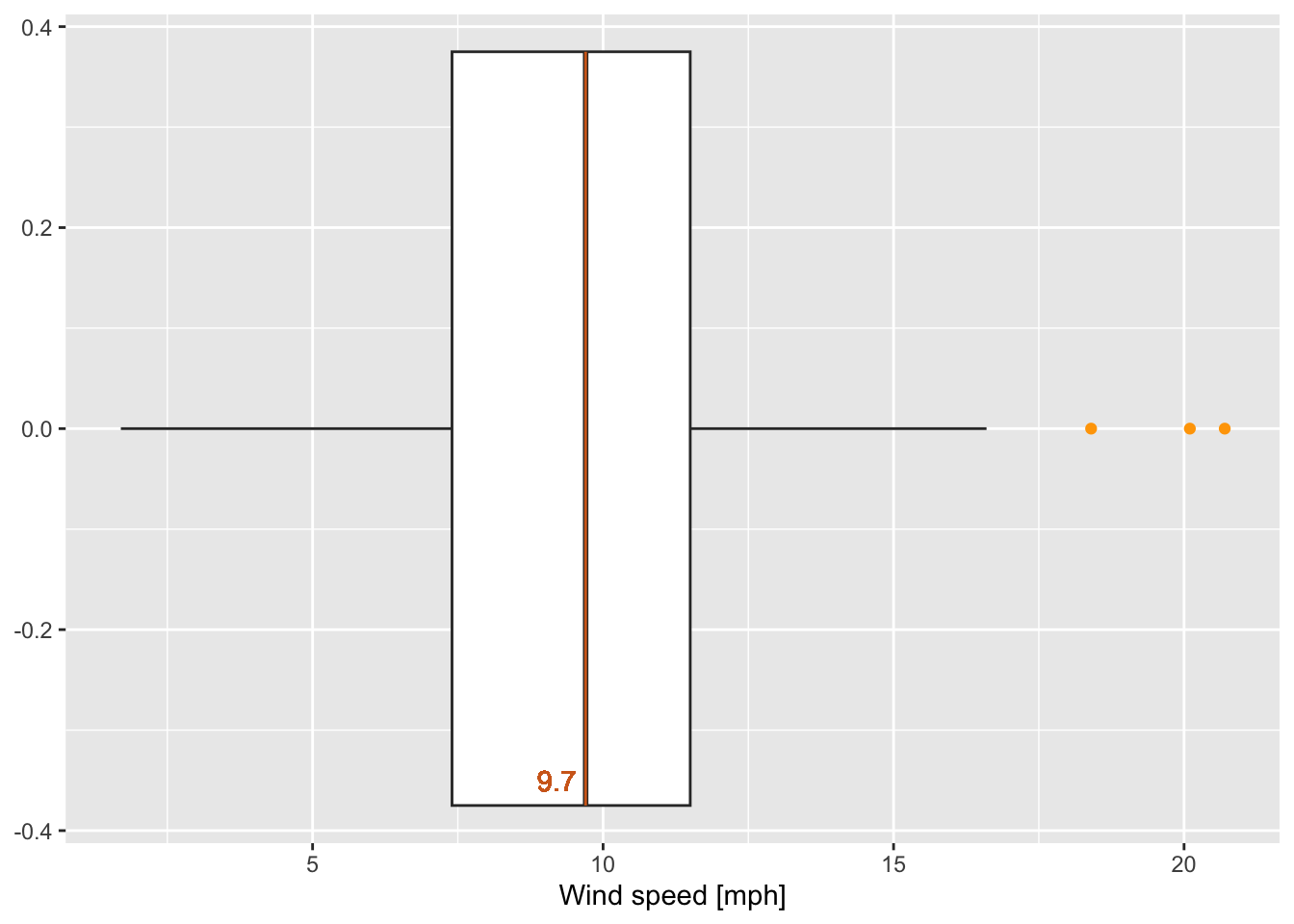
Figure 7.22: Boxplot of wind speed of the airquality data set (R Core Team 2021) with some marked values.
Question(s):
Which values have been marked in the previous boxplot (figure 7.22)?
As we have seen in section 7.1, the airquality data set consists of values from May to September in 1973. (R Core Team 2021) How can we create several boxplots of the temperature for the single months in one plot?
The following code does not work; since Month is a continuous variable!
#R> Warning: Continuous x aesthetic
#R> ℹ did you forget `aes(group = ...)`?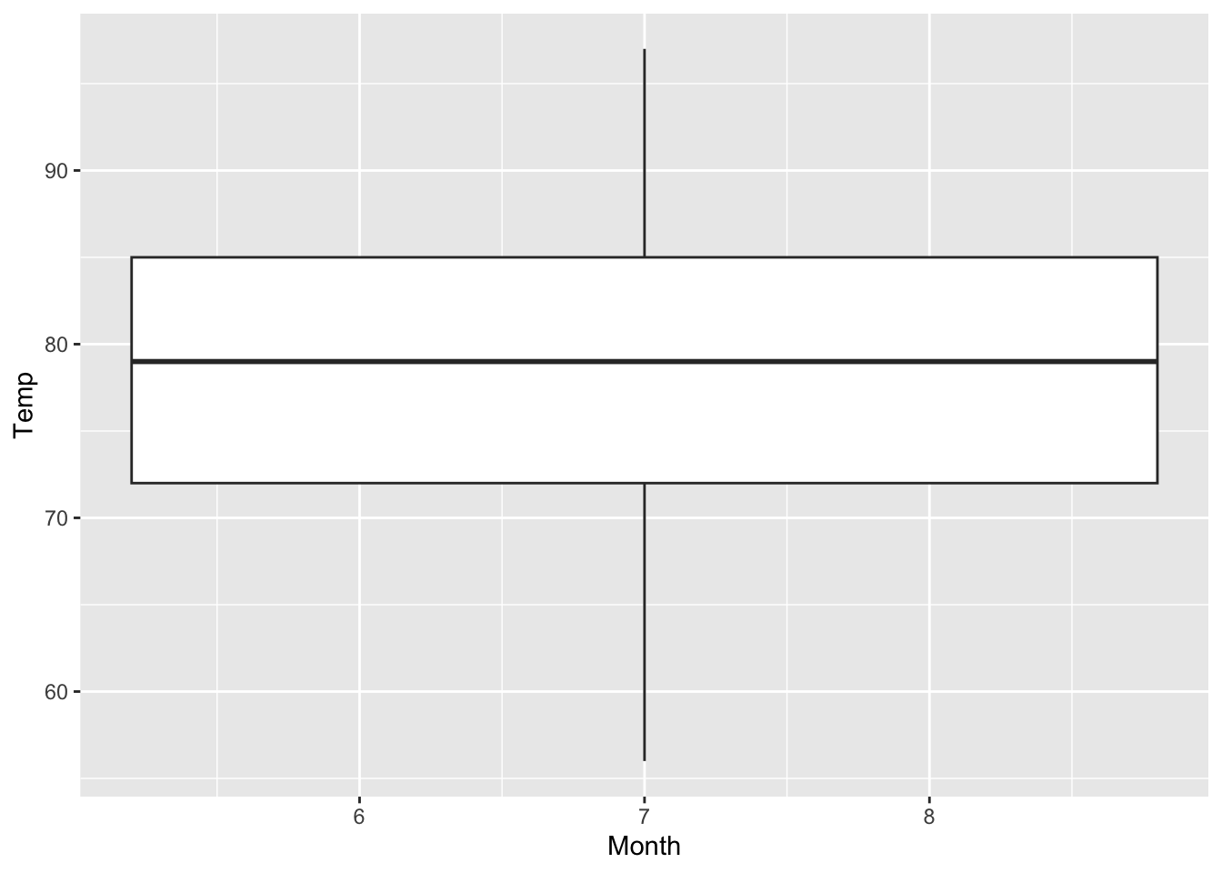
Figure 7.23: Attempt of creating boxplots of the temperature depending on the month (based on the airquality data set (R Core Team 2021)).
The trick is again to create categories; two options exist:
- By generating a factor that consists of the categories “May”, “June”, “July”, “August” and “September” (saved as varibale
Month_categ)
airquality$Month_categ <- factor(airquality$Month, levels = c(5, 6, 7, 8, 9),
                                 labels = c("May", "June", "July", "August", "September"))
and then calling x = Month_categ inside aes() results in the desired boxplots:
ggplot(airquality, mapping = aes(x = Month_categ, y = Temp))+
  xlab("Month")+ ylab("Temperature [°F]")+
  geom_boxplot()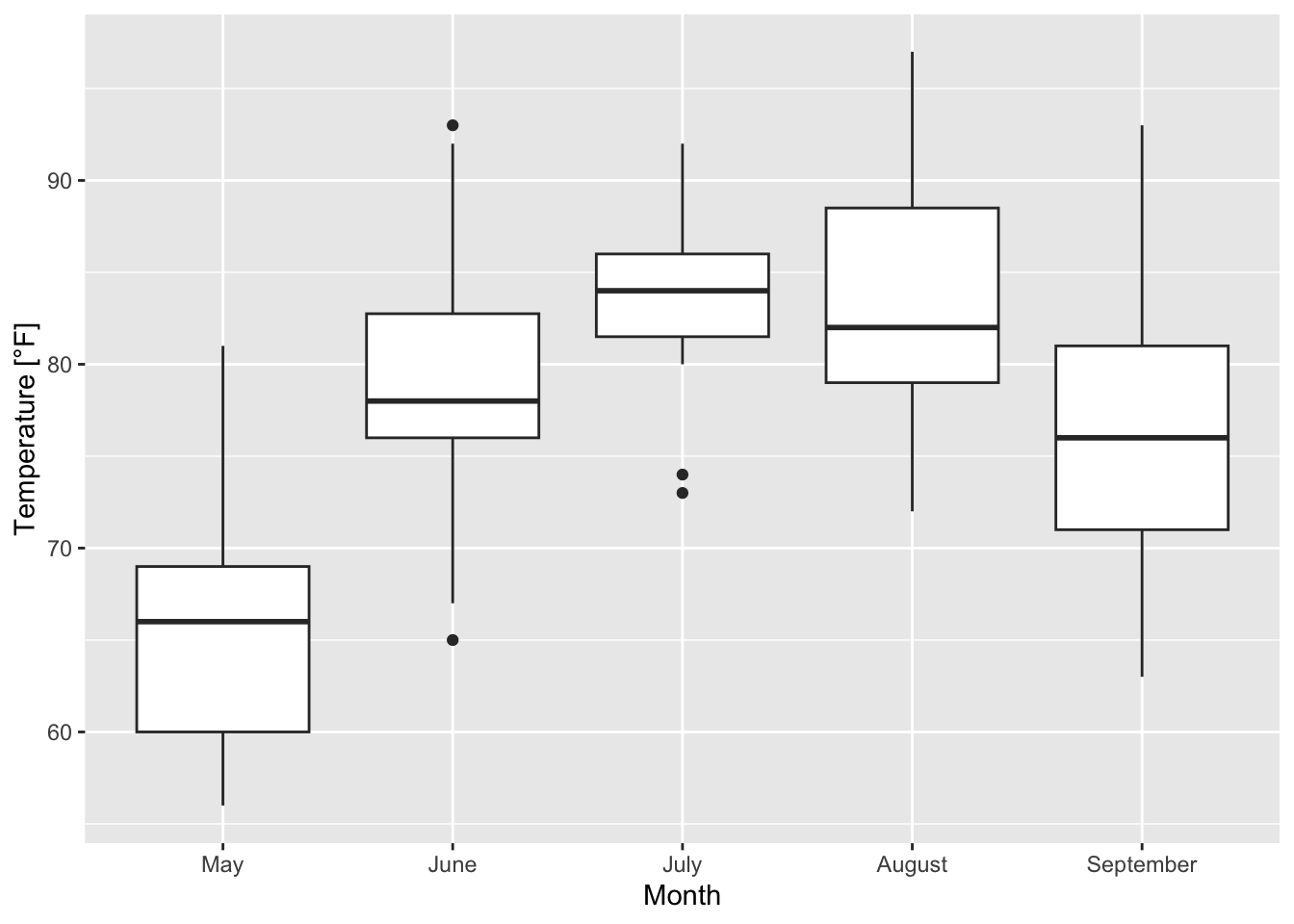
Figure 7.24: Boxplots of the temperature for the single months based on the airquality data set (R Core Team 2021).
- A shorter version is to use the argument
groupinsideaes()(see the warning message of figure 7.23)
ggplot(airquality, mapping = aes(group = Month, y = Temp))+
  geom_boxplot()+
  xlab("Month")+ ylab("Temperature [°F]")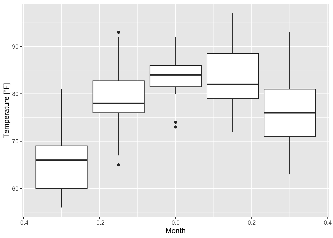
but then the x-axis ticks have to be adapted which might be more complicated than just converting a variable into a factor.
7.2.2 Linear regression
In order to determine and to add a linear regression line to a scatterplot - like the one in figure 7.13 - the geom geom_smooth() with method = "lm" (lm: linear model) is used:
ggplot(data = airquality, mapping = aes(x = Temp, y = Wind))+
  geom_point()+
  geom_smooth(method = "lm", se = FALSE)+
  labs(x = "Temperature [°F]", y = "Wind [mph]") # instead of xlab() and ylab()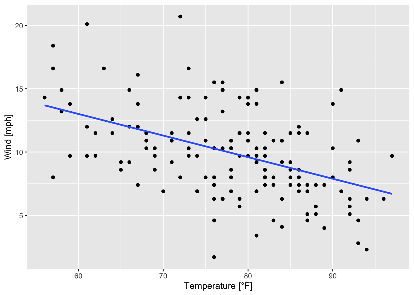
Figure 7.25: Scatterplot of wind speed vs. temperature with a regression line based on the airquality data set (R Core Team 2021).
The argument se is set to FALSE, meaning that no confindence intervals around the regression line are displayed. When se = TRUE it looks like this:
ggplot(data = airquality, mapping = aes(x = Temp, y = Wind))+
  geom_point()+
  geom_smooth(method = "lm", se = TRUE)+
labs(x = "Temperature [°F]", y = "Wind [mph]") 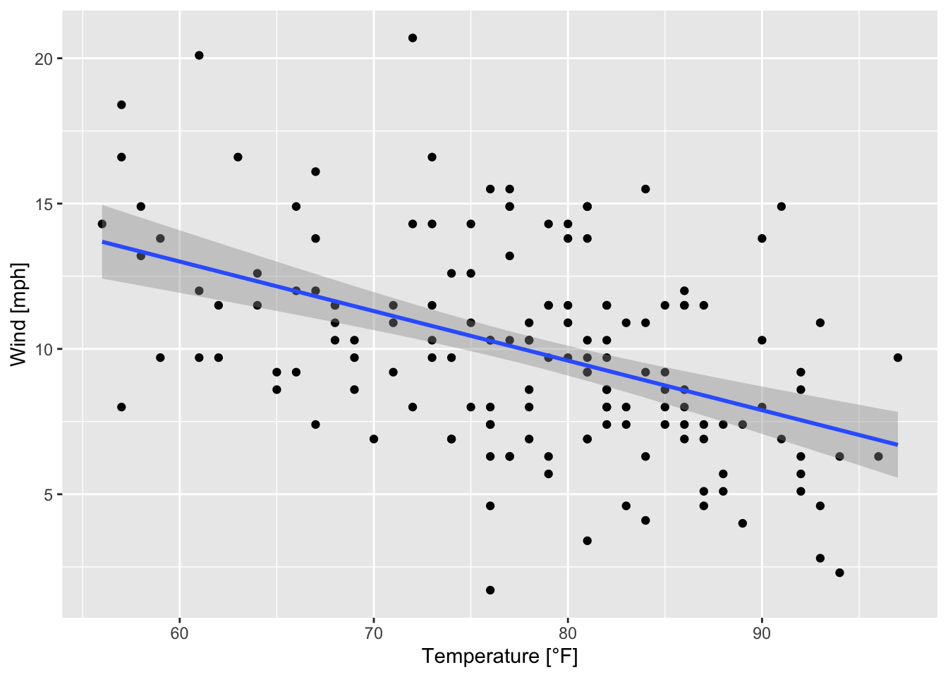
Figure 7.26: Scatterplot of wind speed vs. temperature with a regression line and confidence intervals (based on the airquality data set (R Core Team 2021)).
Remember the definition of linear models in base-R based on function lm() (see section 7.1):
Instead of using geom_smooth(), now, we use geom_abline() to visualize the regression line in the scatterplot as follows:
ggplot(airquality, mapping = aes(x = Temp, y = Wind))+
  geom_point()+
  geom_abline(slope = coef(air_lmodel)[2], intercept = coef(air_lmodel)[1], color = "blue")+
  labs(x = "Temperature [°F]", y = "Wind [mph]")
Figure 7.27: Scatterplot of wind speed vs. temperature with a regression line based on the airquality data set (R Core Team 2021) and geom_abline().
where we accessed the slope and intercept via coef().
7.2.3 Customizing ggplots
Apart from the opportunities to customize ggplots which we have seen so far here are some additional hints to mark points, to modify legends, etc.
Customizing plotting symbols
The following examples are based on figure 7.13 and on the airquality data set (R Core Team 2021).
ggplot(data = airquality, mapping = aes(x = Temp, y = Wind))+
  geom_point(alpha = 0.5, shape = 21, color = "black", fill = "cyan", size = 3, stroke = 1.5)+
ggtitle("Scatterplot of temperature and wind speed")+
xlab("Temperature [°F]")+
ylab("Wind [mph]") 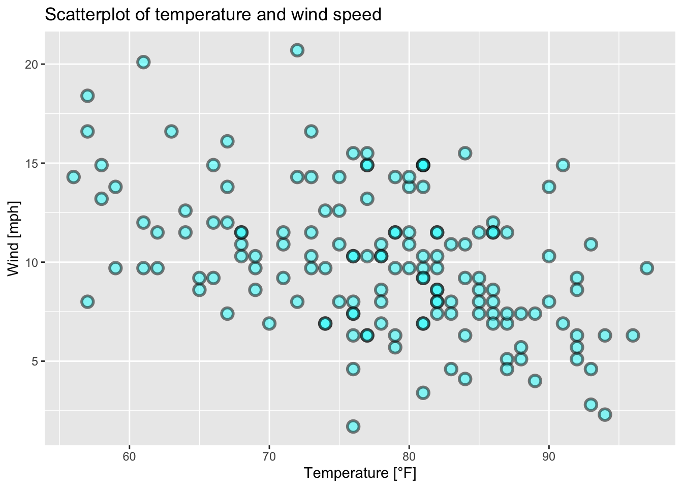
Figure 7.28: Scatterplot of wind speed vs. temperature of the airquality data set (R Core Team 2021) with modified points.
ggplot(data = airquality, mapping = aes(x = Temp, y = Wind))+
  geom_point(alpha = 0.2, shape = 23, color = "black",  fill = "yellow", size = 2, stroke = 2.5)+
xlab("Temperature [°F]")+
ylab("Wind [mph]") 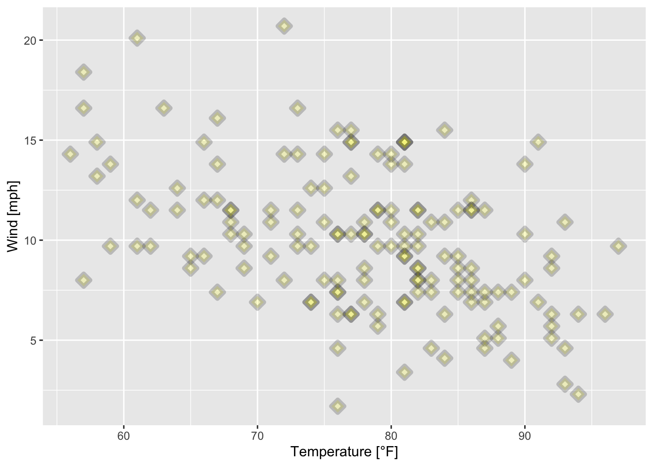
Figure 7.29: Scatterplot of wind speed vs. temperature of the airquality data set (R Core Team 2021) with filled triangular plotting symbols.
ggplot(data = airquality, mapping = aes(x = Temp, y = Wind))+
  geom_point(alpha = 0.2, shape = 23, color = "darkgreen", size = 2, stroke = 2.5)+
xlab("Temperature [°F]")+
ylab("Wind [mph]") 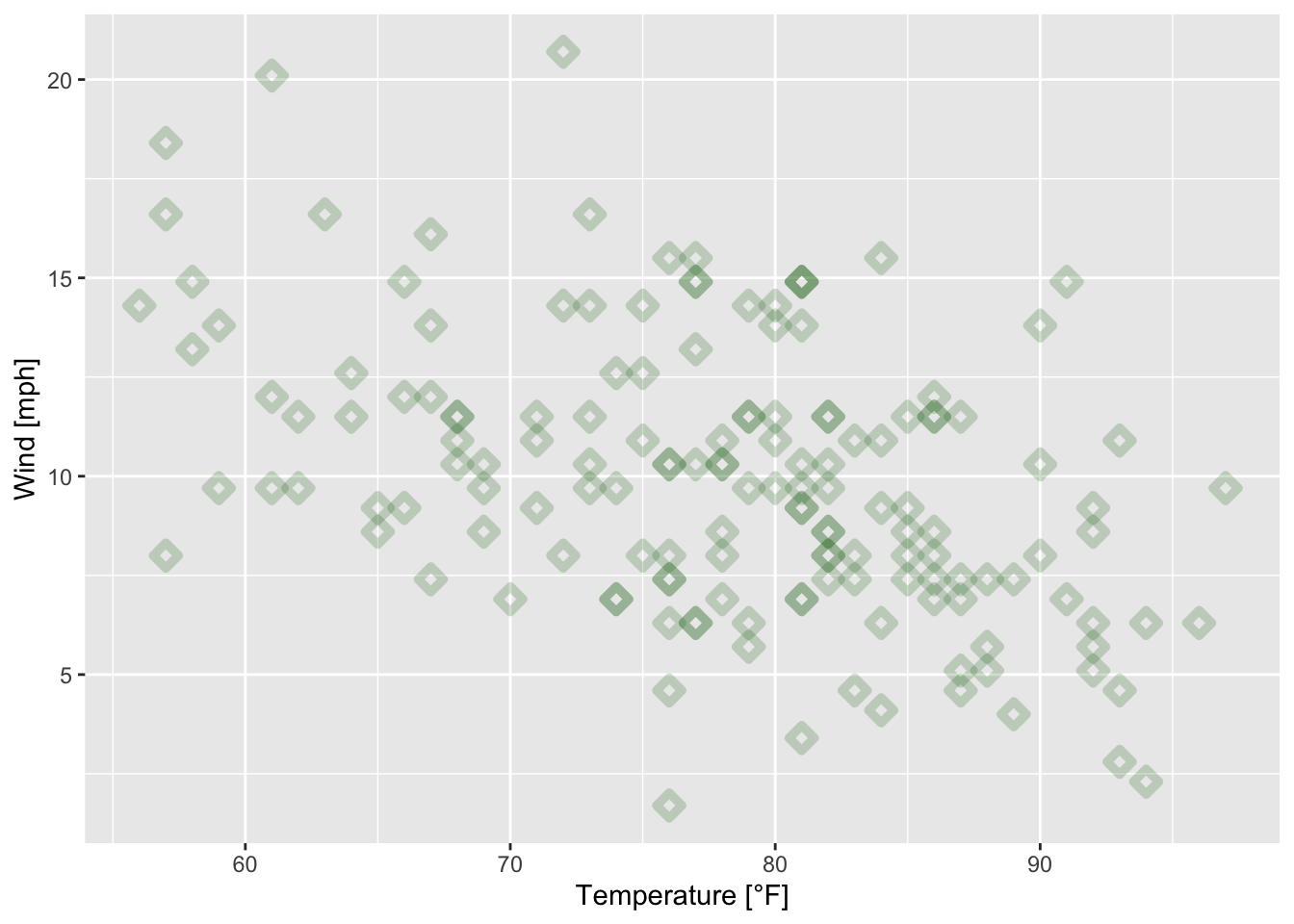
Figure 7.30: Scatterplot of wind speed vs. temperature of the airquality data set (R Core Team 2021) with triangular plotting symbols.
ggplot(data = airquality, mapping = aes(x = Temp, y = Wind))+
  geom_point(alpha = 0.5, shape = 21, color = "grey", fill = "cyan", size = 3)+
  geom_text(mapping = aes(label = ifelse(Temp > 80, Temp, "")))+
xlab("Temperature [°F]")+ ylab("Wind [mph]")
Figure 7.31: Scatterplot of wind speed vs. temperature of the airquality data set (R Core Team 2021); some data points are labeled by their values.
ggplot(data = airquality, mapping = aes(x = Temp, y = Wind))+
  geom_point(alpha = 0.5, shape = 21, color = "grey", fill = "cyan", size = 3,
             position = "jitter")+
  geom_text(mapping = aes(label = ifelse(Temp > 80, Temp, "")))+
xlab("Temperature [°F]")+ ylab("Wind [mph]")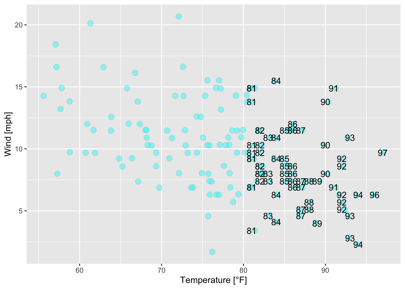
Figure 7.32: Scatterplot of wind speed vs. temperature of the airquality data set (R Core Team 2021) with jittered points.
From figures 7.28, 7.29, 7.30, 7.31 and 7.32 and the corresponding codes we conclude that
the smaller the value of
alpha, the more translucent the data points.the argument
shapecontrols the shape of the plotting symbols (see?points()).the arguments
colorandfillcontrol the color of the symbols dependent on the shape of the symbols (Do the symbols have a border?).the argument
sizecontrols the size of the plotting symbols.the argument
strokewill control the thickness of the border of the plotting symbols if they have one.text is added to the plot (plotting symbols) via
geom_text(maping = aes(label = ...)).position = "jitter"adds random noise to the plotting symbols to avoid overplotting (RStudio, PBC 2021).
Changing scales
Here are some examples how scales can be changed in ggplot2; for further information see RStudio, PBC (2021).
1. example:
ggplot(data = airquality, mapping = aes(x = (Temp-32)*5/9, y = Wind))+ # modify temperature from
  # degree Fahrenheit to Celsius (National Institute of Standards and Technology (NIST) (2021))
  geom_point()+
xlab("Temperature [°C]")+ ylab("Wind [mph]")![Scatterplot of wind speed vs. temperature [°C] based on the airquality data set (R Core Team 2021).](bchwtz-cswr_files/figure-html/scatterplot-wind-temp-1.png)
Figure 7.33: Scatterplot of wind speed vs. temperature [°C] based on the airquality data set (R Core Team 2021).
2. example:
Simulated exponential growth data
with its ggplot
ggplot(data = growth_df, mapping = aes(x = time, y = growth))+
geom_line() + xlab("Time [d]") + ylab("Growth [cm]")![Simulated exponential growth [cm].](bchwtz-cswr_files/figure-html/sim-exp-growth-1.png)
Figure 7.34: Simulated exponential growth [cm].
which can be log-transformed to this:
ggplot(data = growth_df, mapping = aes(x = time, y = growth))+
  scale_y_log10()+ # applying logarithm (base 10) to y values
  geom_line()+ xlab("Time [d]") + ylab("Growth [cm]")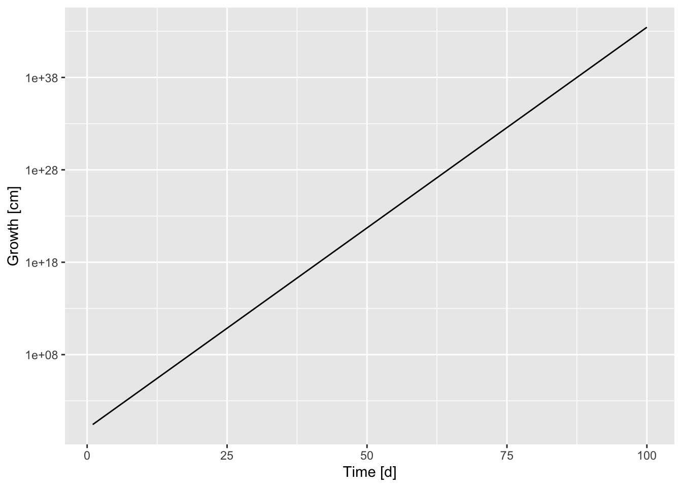
Figure 7.35: Log transformed exponential growth (based on figure 7.34).
Themes - Modifying legends, grids, etc.
The modification of legends is illustrated based on figure 7.24 in which we created boxplots of the temperature for each month. Now, we color the boxplots (one color for each month) by setting fill = Month_categ). A legend has been added automatically:
boxplot_Temp_Month <- ggplot(airquality, mapping = aes(x = Month_categ, y = Temp, fill = Month_categ))+
  xlab("Month")+ ylab("Temperature [°F]")+
  geom_boxplot()
boxplot_Temp_Month 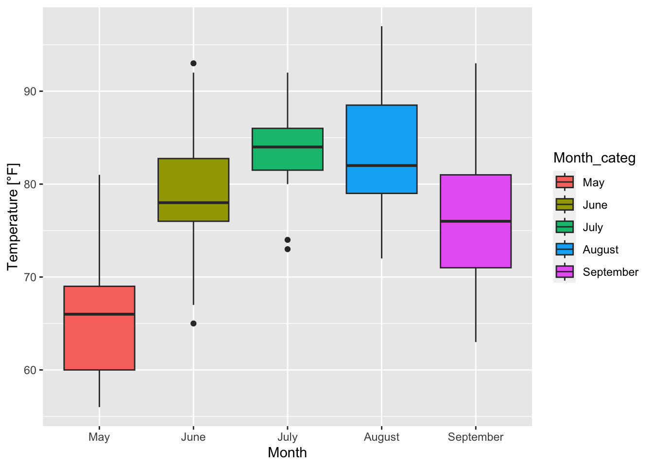
Figure 7.36: Boxplots of temperature for each month based on the airquality data set (R Core Team 2021).
Since the previous plot is saved as boxplot_Temp_Month some more specifications can be easily added to it without repeating every line of code.
boxplot_Temp_Month + guides(fill = guide_legend(title = "Month"))+ # title of legend
  theme(legend.title = element_text(face = "bold"), # make title bold
        legend.background = element_rect(fill = "gray88", colour = "black"),
        legend.position = "top") # change position of legend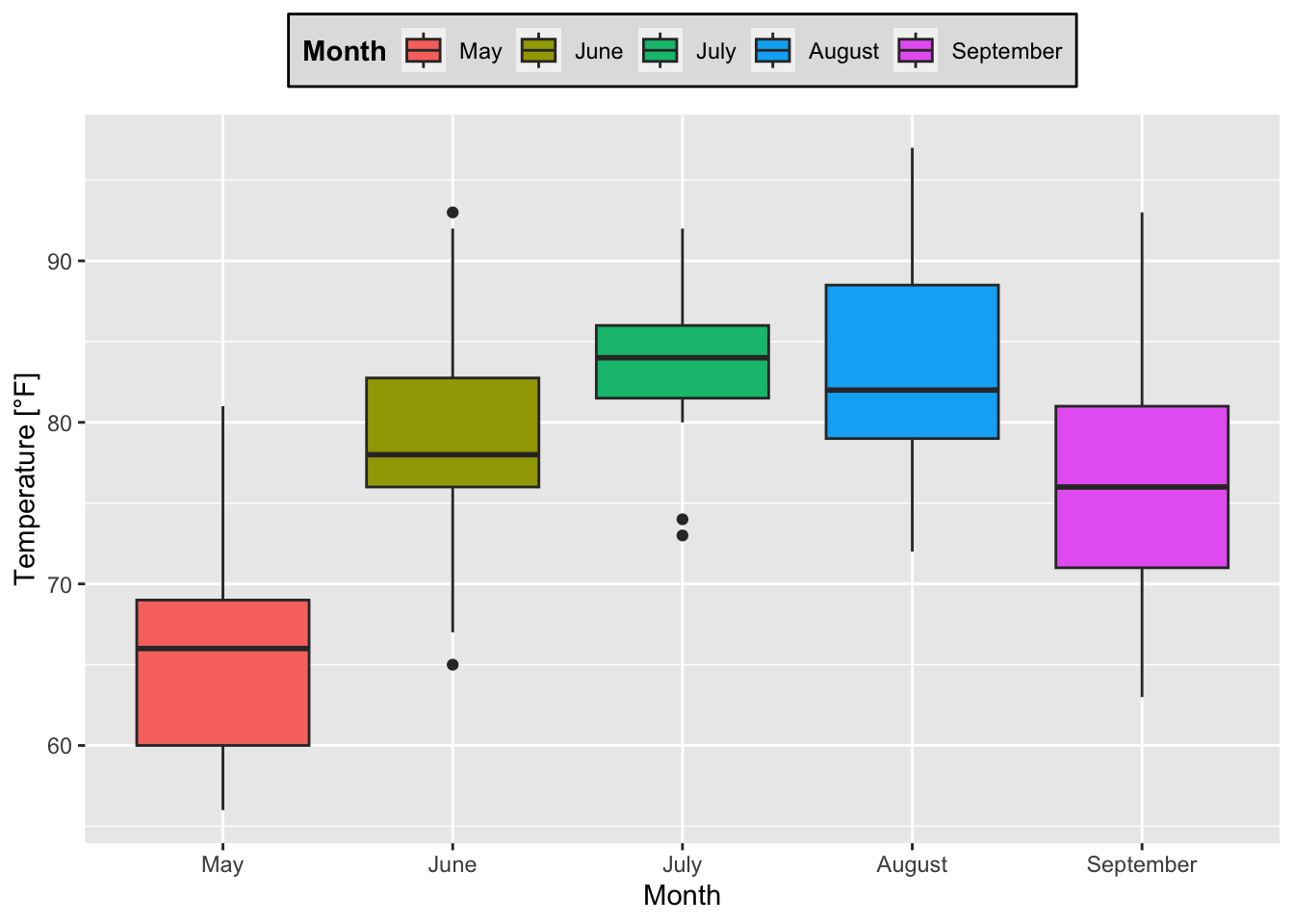
Figure 7.37: Boxplots of temperature for each month based on the airquality data set (R Core Team 2021) with a modified legend.
boxplot_Temp_Month +
  guides(fill = guide_legend(title = "Month"))+ # title of legend
  theme_bw() # black and white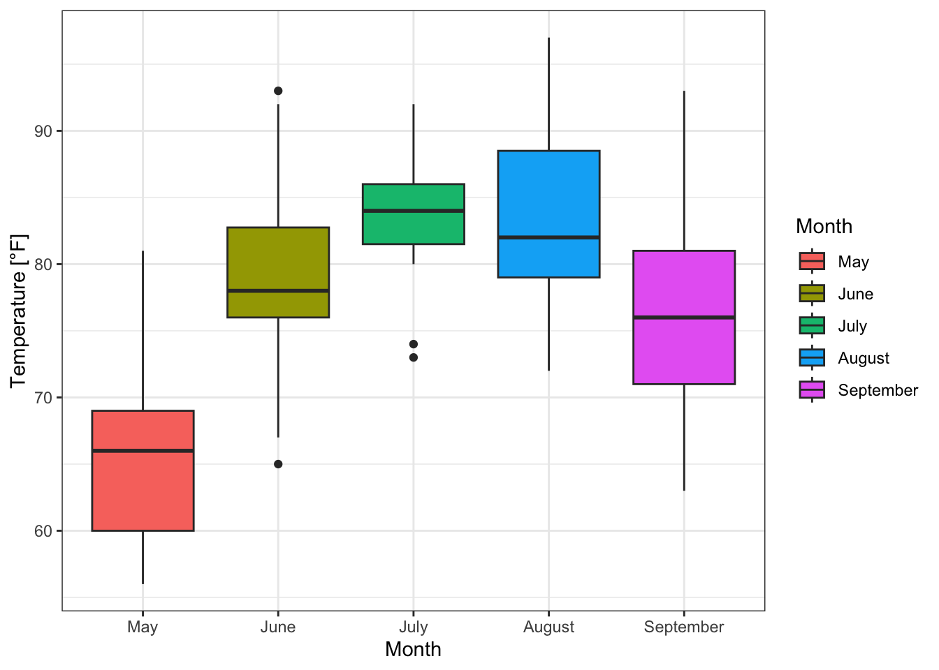
Figure 7.38: Boxplots of temperature for each month based on the airquality data set (R Core Team 2021) with a modified legend and a predefined theme.
From figures 7.37 and 7.38 and their corresponding codes it is obvious that
the legend’s characteristics are accessed via
legend.*insidetheme()(see also http://www.cookbook-r.com/Graphs/Legends_(ggplot2)/ [accessed May 11, 2022]).theme()controls non-data components of plots (arguments for the single components exist) (see?theme).element_*()-functions are used to modify the attributes of the components (for example the color of the legend title), e.g.:element_blank(): nothing is drawn, e.g. to leave out a legend, turning the grid off (see figure 7.39)element_rect(): for borders and backgrounds (rect: rectangle),element_line(): customize lines,element_text(): customize textand some more… (see
element_*for more information).
Another example for using theme() consists of modifying the grid:

Figure 7.39: Boxplots of temperature for each month based on the airquality data set (R Core Team 2021) with no grid.
boxplot_Temp_Month +
  # coloring the background and border:
theme(panel.background = element_rect(fill = "ghostwhite", colour = "black"),
panel.grid = element_line(colour = "gainsboro")) # coloring grid lines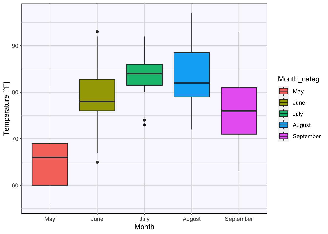
Figure 7.40: Boxplots of temperature for each month based on the airquality data set (R Core Team 2021) with a customized grid.
7.2.4 Handling > 2 variables and faceting
As it was announced in the beginning of this section 7.2 ggplot2 provides help in dealing with more than two variables. The simplest way is to use the arguments of aes() in order to color, group (see figure 7.24),… values, for example:
ggplot(airquality, mapping = aes(x = Temp, y = Wind, color = Solar.R))+
  geom_point()+
xlab("Temperature [°F]")+ ylab("Wind [mph]")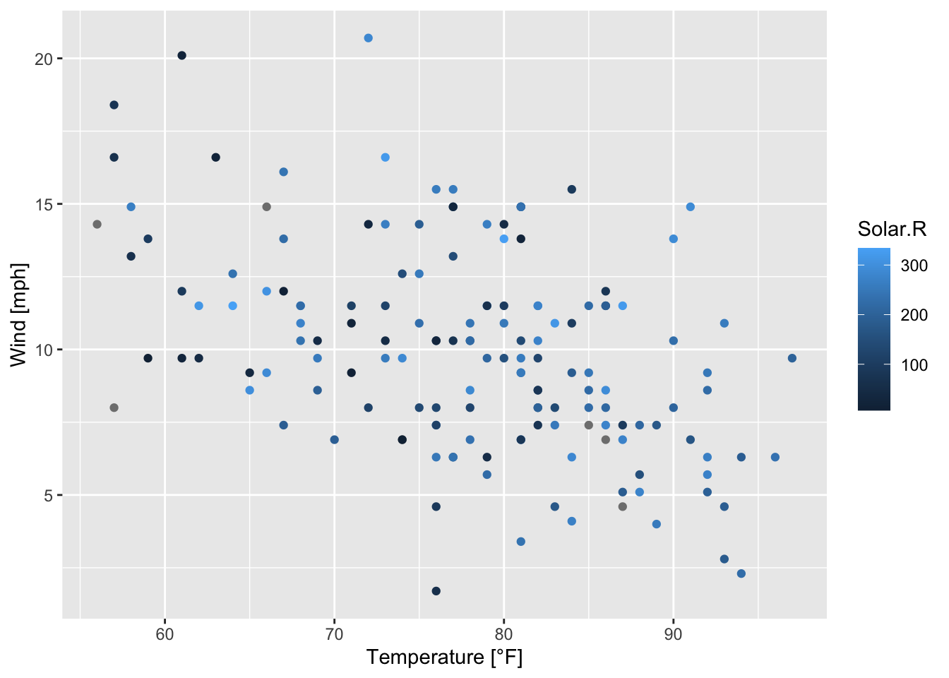
Figure 7.41: Scatterplot of wind speed vs. temperature colored by solar radiation based on the airquality data set (R Core Team 2021).
Consequently, dealing with three variables is also quite simple, but how can we handle four or more variables in a two-dimensional plot?
airquality$Month_categ <- factor(airquality$Month, levels = c(5, 6, 7, 8, 9),
                                 labels = c("May", "June", "July", "August", "September"))
We can simply define multiple arguments inside aes(), e.g. each month shall be represented by its own plotting symbol and their sizes are dependent on the solar radiation. As a consequence, multiple legends result.
ggplot(airquality, mapping = aes(x = Temp, y = Wind, size = Solar.R))+
  geom_point(aes(shape = Month_categ))+
  ggtitle("Scatterplot of temperature and wind speed")+
xlab("Temperature [°F]")+ ylab("Wind [mph]")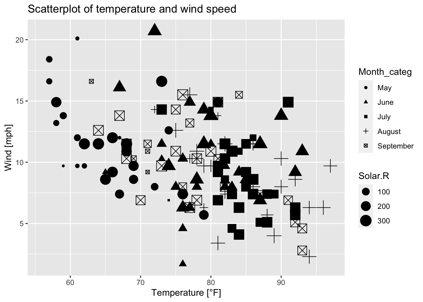
Figure 7.42: Scatterplot of wind speed vs. temperature where the shape of the plotting symbols is dependent on the month and their sizes are dependent on solar radiation; based on the airquality data set (R Core Team 2021).
Another option is to use faceting; a plot is divided into subplots. (RStudio, PBC 2021) Figure 7.42 can be transformed by faceting; figures 7.43 and 7.44 result:
ggplot(data = airquality, mapping = aes(x = Temp, y = Wind, color = Solar.R))+
  geom_point()+
  facet_wrap(~ Month_categ, nrow = 3, ncol = 2)+ # rectangular layout
  # (by default: nrow = 2, ncol = 3)
  labs(x = "Temperature [°F]", y = "Wind [mph]")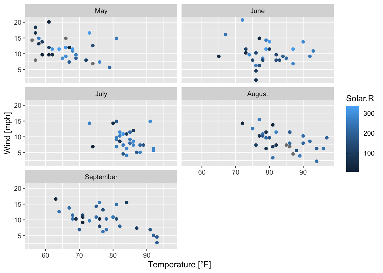
Figure 7.43: Subplots of the scatterplots of wind speed vs. temperature by month; based on the airquality data set (R Core Team 2021) and facet_wrap().
air_ggplot <- ggplot(airquality, mapping = aes(x = Temp, y = Wind, color = Solar.R))+
  geom_point()+
  facet_grid(rows = vars(Month_categ))+
  labs(x = "Temperature [°F]", y = "Wind [mph]")
air_ggplot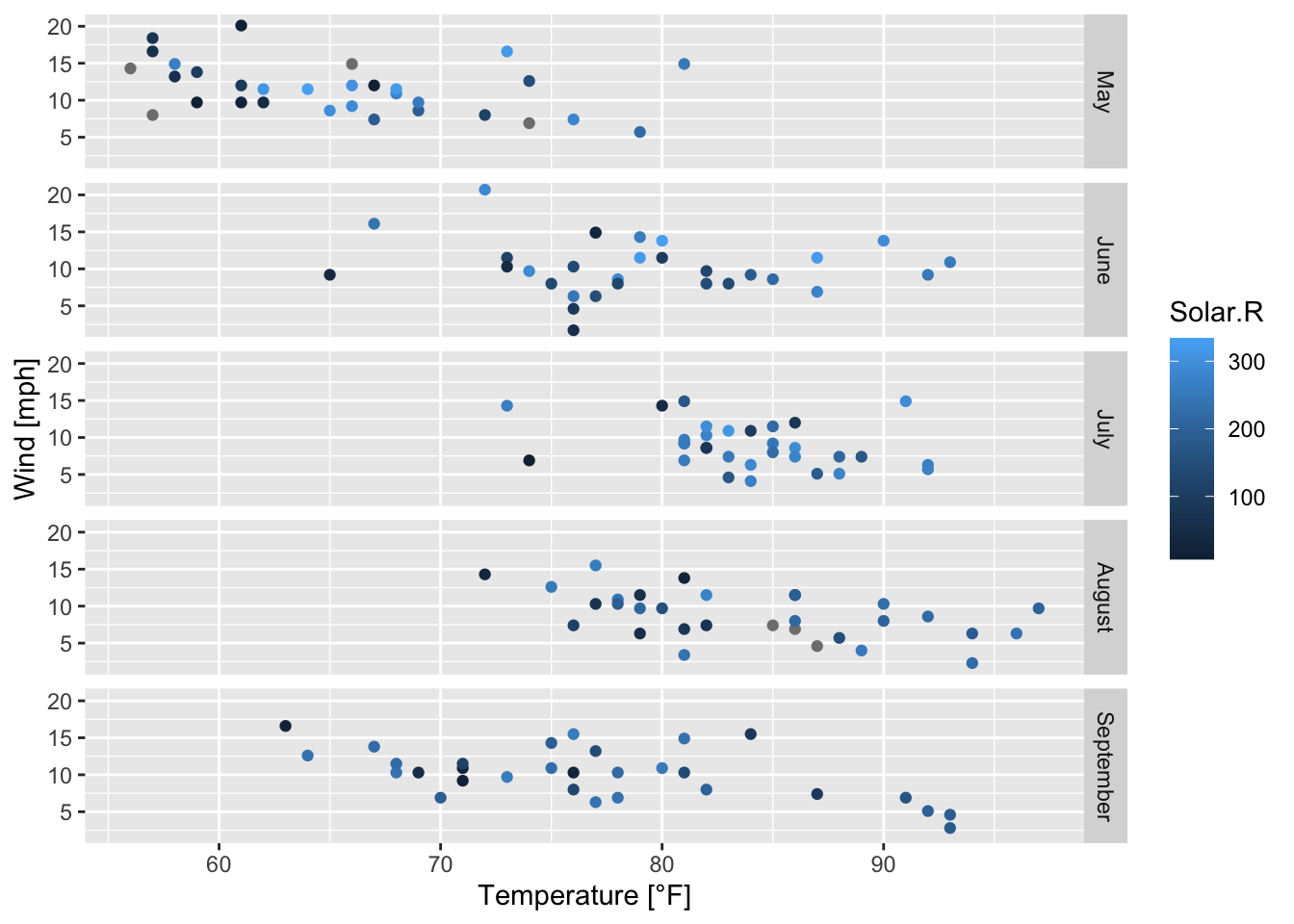
Figure 7.44: Subplots of the scatterplots of wind speed vs. temperature by month; based on the airquality data set (R Core Team 2021) and facet_grid().
Some more examples based on faceting:
air_ggplot + # call the already defined ggplot
  geom_smooth(method = "lm", se = FALSE, color = "orange") # adds a linear model to each subplot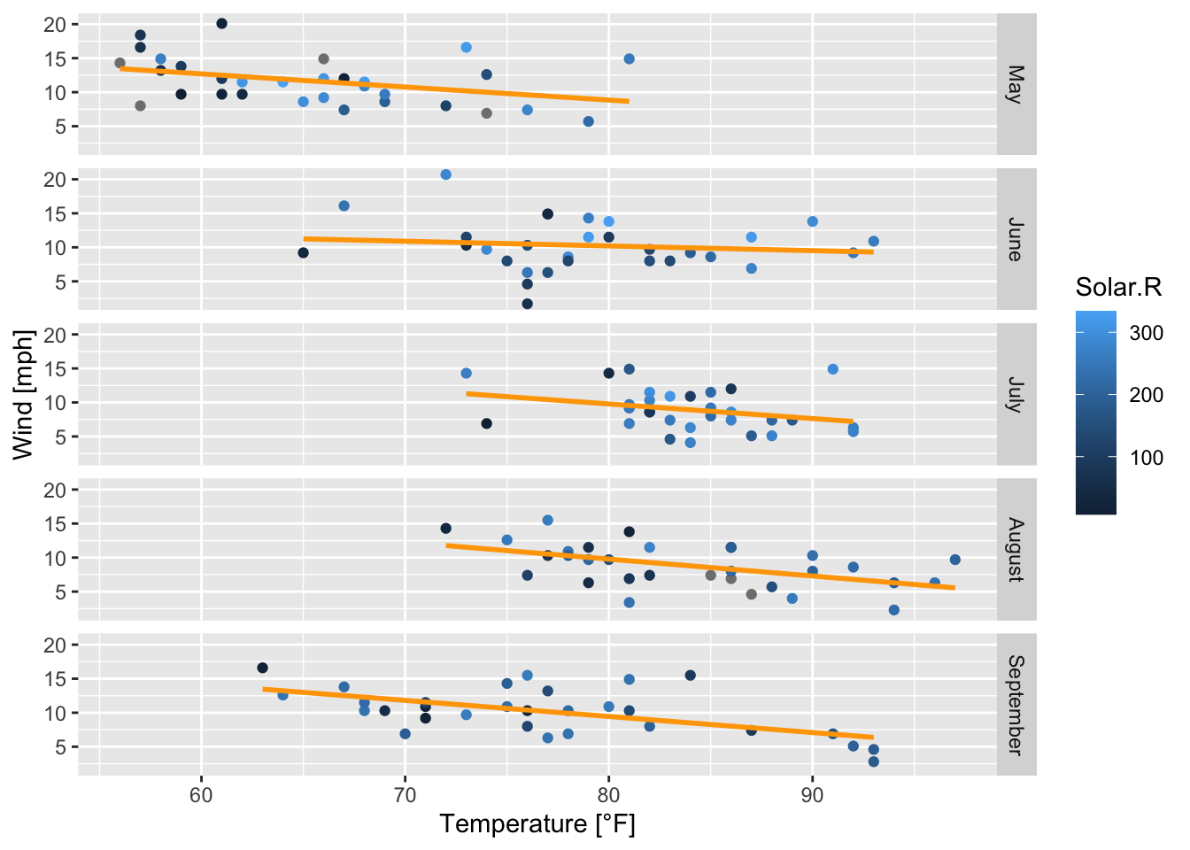
Figure 7.45: Subplots of the scatterplots of wind speed vs. temperature by month with regression lines; based on the airquality data set (R Core Team 2021).
air_ggplot + # call the already defined ggplot
  geom_smooth(method = "lm", se = TRUE, color = "orange") # adds a linear model to each subplot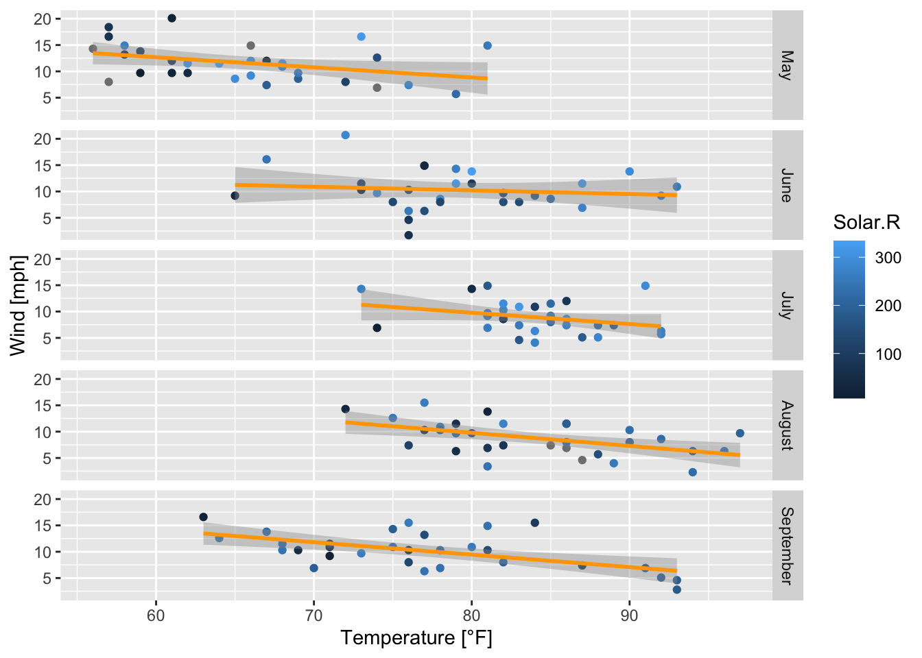
Figure 7.46: Subplots of the scatterplots of wind speed vs. temperature by month with regression lines and confidence intervals; based on the airquality data set (R Core Team 2021).
7.3 Interactive plots with plotly (Sievert 2020)
When a ggplot has been created it can be converted to an interactive plot based on the R package plolty (Sievert 2020), meaning that by clicking with the mouse on a plotting symbol its values are shown. In figure 7.47 the x- (Temp: 74) and y-value (Wind: 12.6) are displayed. For an introduction in plotly see Sievert (2019).
air_lm_ggplot <- ggplot(data = airquality, mapping = aes(x = Temp, y = Wind))+
geom_point()+
geom_smooth(method = "lm", se = FALSE)
ggplotly(air_lm_ggplot) # converts ggplot2 to a plotly object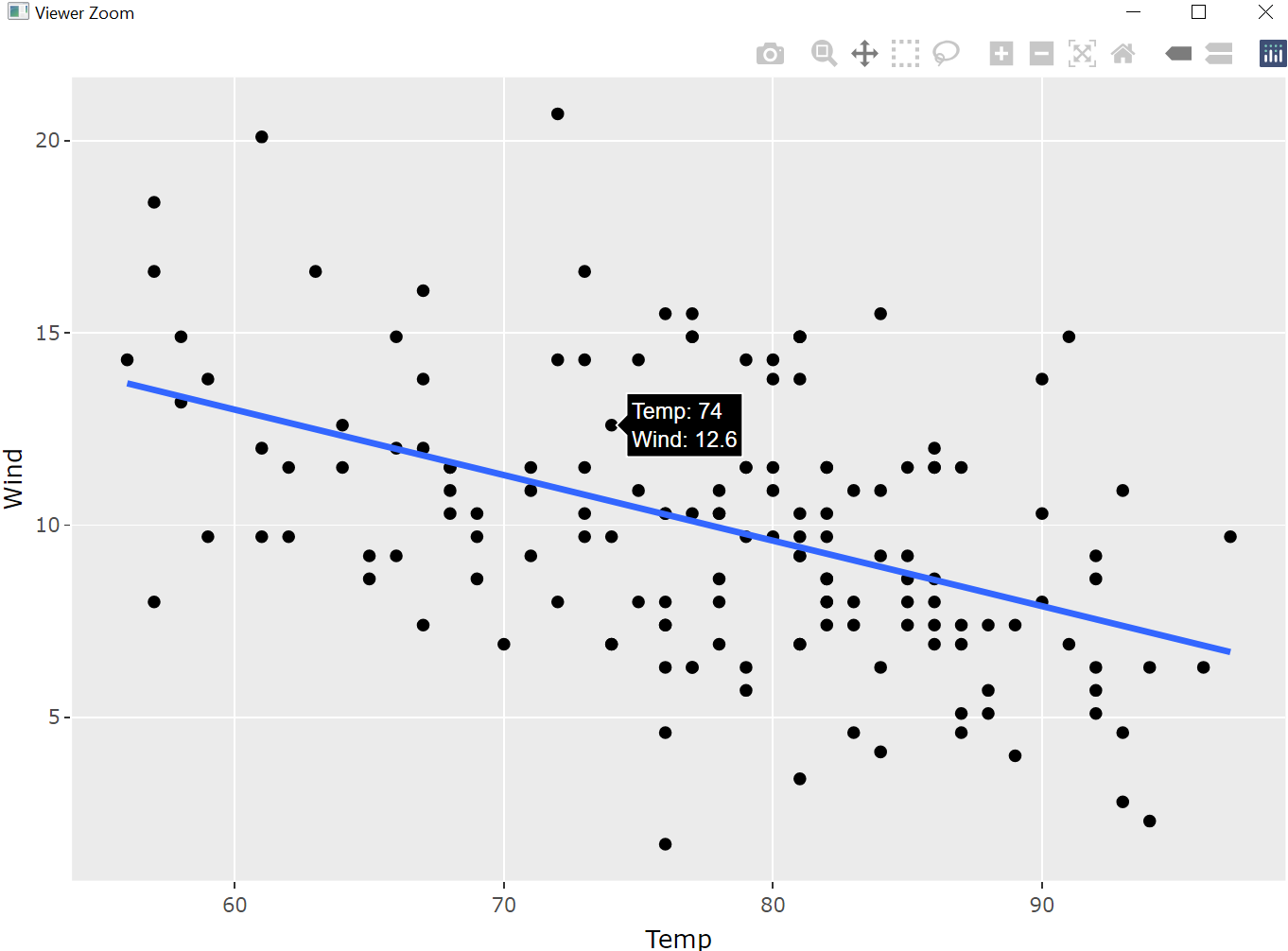
Figure 7.47: Two-dimensional plot (plotly object) based on air_lm_ggplot.
From figure 7.47 it becomes clear that ggplotly() opens a new window in which the generated three-dimensional plot can be zoomed in and out, can be shifted within the window and turned around, etc.
Besides, plotly provides the function plot_ly() which allows generating three-dimensional plots like the following one:
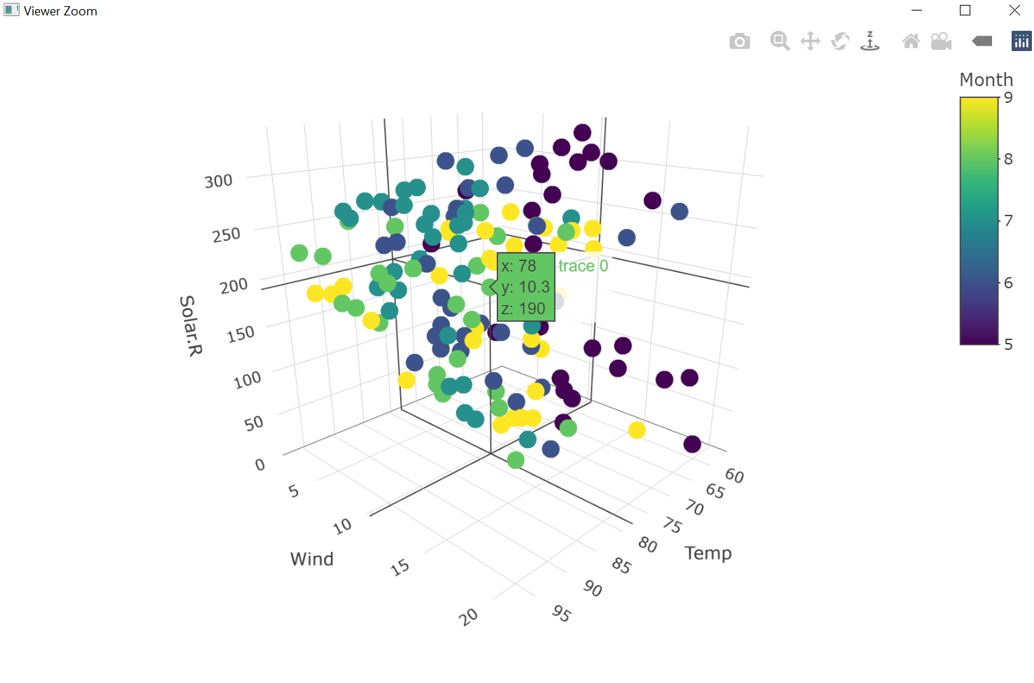
Figure 7.48: Three-dimensional plot (plotly object) based on datasets::airquality (R Core Team 2021).
From figure 7.48 we see that plot_ly() also opens a window in which the user can examine the created three-dimensional plot.
Excercises
Task mtcars dataset
In your R environment the mtcars data set (R Core Team 2021) is
available.
Plot the cars’ weights vs. the miles per gallon, colored by horsepower dependent on the number of cylinders.
Add to your plot from 1) a horizontal line that goes through the point (0, 2.5).
Change the plot you have created so far (1)-2)) by coloring all data points that lie below the horizontal line in red, whereas all other data points are colored in green-blue.
Change the plot you have created so far (1)-3)) by differentiating between those observations whose number of cylinders is equal to four and the rest.
Label the resulting panels by setting
labeller = (cyl = label_both)and see what happens.Plot miles per gallon vs. weight and fit a linear regression model. Create a plot on the one hand with base R and on the other hand with
ggplot2.
References
Arnold, Jeffrey B. 2020. R for Data Science: Exercise Solutions. Chapter 3.7: Statistical Transformations. https://jrnold.github.io/r4ds-exercise-solutions/data-visualisation.html#statistical-transformations.
Auguie, Baptiste. 2017. GridExtra: Miscellaneous Functions for "Grid" Graphics. https://CRAN.R-project.org/package=gridExtra.
Meschiari, Stefano. 2022. Latex2exp: Use Latex Expressions in Plots. https://CRAN.R-project.org/package=latex2exp.
R Core Team. 2021. R: A Language and Environment for Statistical Computing. Vienna, Austria: R Foundation for Statistical Computing. https://www.R-project.org/.
RStudio, PBC. 2021. Data Visualization with Ggplot2::CHEAT Sheet. https://raw.githubusercontent.com/rstudio/cheatsheets/main/data-visualization.pdf.
Sievert, Carson. 2019. Interactive Web-Based Data Visualization with R, Plotly, and Shiny. Chapman; Hall/CRC. https://plotly-r.com.
Sievert, Carson. 2020. Interactive Web-Based Data Visualization with R, Plotly, and Shiny. Chapman; Hall/CRC. https://plotly-r.com.
Wei, Y. 2021. Colors in R. Department of Biostatistics, Columbia University. http://www.stat.columbia.edu/~tzheng/files/Rcolor.pdf.
Wickham, Hadley. 2016. Ggplot2: Elegant Graphics for Data Analysis. Springer-Verlag New York. https://ggplot2.tidyverse.org.
Wickham, Hadley, and Maximilian Girlich. 2022. Tidyr: Tidy Messy Data. https://CRAN.R-project.org/package=tidyr.
Wilkinson, L. 2005. The Grammar of Graphics. 2nd ed. New York: Springer.
Wilkinson, Leland. 2010. “The Grammar of Graphics.” Wiley Interdisciplinary Reviews. Computational Statistics 2 (6): 673–77.